storage for my paper projects...come take a look!
Showing posts with label scrappy chic. Show all posts

09 July 2012

one line, two ways - part two

Hello again!
Today I have more layouts from my June kit from Scrappy Chic -- and once again, I made two rather different layouts with just one line of paper. This time around, it's KaiserCraft's Check In, which is ostensibly a travel line, though calling these "travel" pages would be a stretch, for sure!

First up, a page about one of my husband's choirs - 


How considerate of them to match my papers so well with their red and black performance outfits. ;) This color scheme pretty much wrote itself, and I used one of my favorite go-to layouts: trim the patterned paper to size, cut it into two pieces, and flip one of them. Done. The embellishments keep it looking fresh -- here I used some of the perforated elements from the line, plus a border punch, some ribbon, and black alphas that almost match the patterned paper.


I also turned to Jenni Bowlin (queen of red and black) and grabbed some gems and butterfly stickers from my J.B. stash, along with a new stamp set from Maya Rd to house a bit more patterned paper. Andrew actually liked this one so much he took it into school to show the kids in the choir -- isn't that sweet?

For my second page, I went in a different direction, color-wise:

This actually looks busier in the photo than it does in real life, I swear -- but here, I scrapped Andrew's childhood love for an antique traffic signal. Yep. The big, awesome historical museum near us recently redid their whole transportation exhibit (and in Detroit, transportation exhibits are kind of a big deal), and Andrew was worried that his traffic light wouldn't be part of the refurbish...but it was. Happy boy. So this time around, I used the road and ticket images from the line to fit the nature of the museum's exhibit rather than a real road trip.


Those tickets come from the line, and I added some more Jenni Bowlin stickers (since they were on my desk), plus some punched circles from one of my favorite Hambly transparencies (RIP :( - I'll miss them).

Well, that's enough words from me for one day, don't you think? You can see these projects and get your hands on the products I used at Scrappy Chic -- as always!

{Ok, one more thing: I'm fortunate enough to be headed off to CHA for a second time! We'll be heading out early for some pre-show events, and then I'll be right in the thick of things once again -- I can't wait! So, I'll likely be posting some quick and photo-heavy posts while I'm there...if there are any lines, projects, or people you'd like to see more or less up-close, be sure to let me know! In the meantime, you can access a great list of all the sneak peeks here -- they're starting to come in pretty heavily this week!}

Have a great Monday!

05 July 2012

one line, two ways - part one

Well, hello there! Pardon my brief absence -- we went to Chicago for a few days (nice little mini vacation -- mini album to follow ;) ), and then came back just in time to spend the 4th with family and fireworks. Happy Independence Day (a bit late), and Happy Canada Day, too (a bit later!).

In my June kit from Scrappy Chic, it just so happened that I had papers from We R Memory Keeper's monthly line, Red White and Blue. Needless to say, they were very patriotic papers, with a bit of a military theme. Unfortunately, I was scrapping with them sans any photos that fit either theme! What's a girl to do? 

First, I selected a photo that I wanted to scrap and that fit well with the colors -- one of my parents' dog, Roxy. Then, I searched my stash for a bit of inspiration to both tie the colors of the line together AND pull away a bit from the patriotic-ness. Here's what I found:


Yup, just one sticker (this one's from American Craft's Chap line) -- but it has blues, red, AND a golden yellow -- ta da! Suddenly, instead of a patriotic color scheme, I had a primary color scheme with a twist. Here's the layout in full:


Now it's a festive layout about a cute dog that just happens to include some stars. Nice! I made sure to repeat the yellow enough to make it look intentional -- the inspiration sticker, the title (basic grey and october afternoon alphas), the label sticker up top, and in this embellishment cluster:


I added pins from Maya Road, a paper clip flag from Smash, and more stars in sticker and veneer form (the veneers are Studio Calico, and they're sprayed with yellowish Mister Hueys).  I call it a success!!

But after all, it is a patriotic line, so I made a bit of patriotic decor as well:


I used star tins from Maya Rd along with die-cut stars, circles, and scalloped circles to pull this one together (I used my beloved new Silhouette for the die-cutting, but simple shapes like these are available for any system). 


The tins (which are about 2.5" across, if you'd like a sense of scale) are painted with Ranger Distress Paint first, then the stars are added, then the tins got a layer of crackle medium (mine was Ranger also, but other brands exist). The little alphas are LilyBee (kit leftovers from the other week), and the large alphas are old Thickers.


You can really see the crackle effect here. Twine from Maya Rd. and Divine Twine tie it all together...literally. You can find both projects at Scrappy Chic, as well as on their blog today. You'll find me at the store today as well -- it's Freedom Grab day! Get your shopping on, local folks!

Enjoy your day, and see you soon.


29 June 2012

mega meet - scrapped!

Happy Friday, everyone -- I hope you're keeping cool! It seems like the whole hemisphere is toasty. I was out last night at around 11, and it was still 90 degrees. Nuts, I tell you.

But that's not what you're here for -- how about a layout using my June kit from Scrappy Chic?


All kinds of yummy My Mind's Eye goodies here -- papers and stickers from the new Indie Chic line (it was hard to choose which of the four colorways to scrap with -- they're all so pretty!), plus some fun accents. The title is on a wood pennant from an older MME line, stamped with chalk ink (works great on wood). The burlap ribbon and butterflies are both from Maya Rd -- the butterflies are misted with two shades of pink Mister Hueys. {Note to alert viewers: if you notice an irregularity in the top-left butterfly, it's because Simon managed to pry it off the layout and chew on it! Yes, I just stuck it back on. Don't judge. ;) } A row of random bling beneath the photo (of Scrappy Chic's owner, Chris, and her fab mom, Linda, working the booth at Mega Meet in May), and I called it good.

I have more projects from my kit, and I'll be sharing those with you next week. Until then, stay cool!!

13 June 2012

neon - who knew?

I'll be the first to admit that I'm a fan of trends -- in fashion as in paper, I love seeing what's new and watching it spread like wildfire! When it comes to fashion, there's one rule I tend to follow, though: If I'm old enough to have participated in a trend the last time it was "in," I probably shouldn't be following it now.

Well, rules are made for breaking, right? I hope so, because I'm a little bit in love with...neon. Or, as I called it in the 80s, fluorescent (man, neon is easier to spell!). I have some neon pink nail polish, a neon tank top, and I'm considering a neon purse, even. Craziness. And, of course, neon has invaded my paper world as well. I was pretty excited to see that Heidi Swapp was not only returning to the scrapbook design world, but that one of her new lines is...neon! So, let's take a look, shall we?


I wanted to downplay the 80s-ness of neon here, so I paired it with kraft, which makes the washi tapes, alphas, and gel pens pop without being too painful on the eyes ;). I made the flower by hand, using a Gluber and some vintage pattern tissue -- I kind of made it up as I went along. The brown alphas started off all white -- they're meant to be misted/inked/whatevered.


In case you couldn't tell, I went in the opposite direction here -- hello, 80s! The grey cardstock is shimmery, the tape is graphic, the sentiment -- well, could it be more appropriate? Plus, this card was super-duper quick -- and made from scraps (bonus!). I made both of these projects for Mega Meet last month, and now you can see them at Scrappy Chic. If you'd like to see Heidi Swapp's products, they're here (but remember, neon doesn't always look good on-screen).

So, what's the verdict from your point of view -- is neon a welcome return...or are you thinking "gag me with a spoon"?

Have a rad day!

11 June 2012

simon, in case you missed him.

In the past few months I've spent away from blogging, I've spent plenty of quality time with the cats ;)
In those same few months, Simon the kitten became Simon the Giant! He's just over a year old now, yet he's longer, taller, and heavier than Dex (who is 10 and a bit of a chunk). He's also, fortunately, very, very photogenic. Let's take a look, shall we?


Here I scrapped my handsome boy with some October Afternoon, mostly to prove to myself that their Sasparilla (sic) line needn't be a little-boys-only kind of line. The map and woodgrain prints are both fairly low-key, perfect for highlighting one of my all-time favorite Simon pictures. I kept the whole thing pretty simple to keep the focus on the photo.


Oh, this layout made me happy -- and not just for the crazy-hilarious-slightly-lewd (and absolutely NOT elegant) photo of Simon napping (more on that in a moment). I'd been sketching layout ideas (I use this little sketchbook, by the way - the daily spots are the perfect size for layouts), and I had this idea that a bunch of tags and elements would make for a fun, graphic, linear kind of layout. I think it worked :). Here, I used Crate Paper's Story Teller collection, which has tag and accent cut-apart sheets that were perfect for this job, along with that wonderful cork-printed paper in the background. Love. This. Layout. It's also really quite simple, even with all the various pieces -- again, the photo tells a story, so I didn't want much in the way of embellishments.

You can find both of these layouts, as well as all the goodies I used to make them, at Scrappy Chic.

Now, about that photo:


This was a 90-plus degree day in May, and Simon conked out in exactly this pose for around half an hour without moving! I thought it was hilarious and absolutely adorable... not that I'm biased at all!  Oh, I'm such a cat lady, aren't I? To prove it, this fact: cats grow until they're about two years old. Any bets on how big Simon will be by then?!

Anyway, that'll do for now -- I'll be back soon with some neon goodness (and I'll show some Dexter photos soon, don't worry).

Until then, enjoy yourselves!

06 June 2012

color riot!

As promised, today I have more Amy Tangerine Sketchbook, but this time in a -- shall we say -- less minimal kind of way!


I have come to realize that I am the kind of photography nerd who will pull into  a parking lot somewhat randomly to take photos of a Ferris Wheel. That's what's documented here -- not a day at the fair, nothing about odd carnies or hot-pants-wearing fashion victims. Just a Ferris Wheel. Because it looked cool against the fading daylight.


I was super-happy to get my paws on the Stepping Stone alphabet stamps there in the "photo" part of the title (Hero Arts/Studio Calico) -- the set includes an outline and a solid image of each letter, making colorful words ever so easy. The hex stamp is Studio Calico, too (from a kit), and the tapes are from various sources, but almost everything else is Amy Tangerine. I (ME! Really!) fussy-cut both the stamped hexagons and the cameras (which are highlighted with an inkpad-blender pen combo). I think I might go back and add one more hexagon, right at the bottom edge. Hmm. Check out the top photo and tell me if you agree, eh? Thanks.


A little fabric-sticker date-stamping, a little doily-stamping-and-coloring, and I called it good. Man, but do I love color. If you can believe it, this layout is even brighter in real life! And as always, almost everything you see here is available at Scrappy Chic for local folks and the interwebs for the rest of y'alls.

Shall we have a card next time? Yes, I think we shall. Enjoy life until then!

04 June 2012

a layout and a shout-out

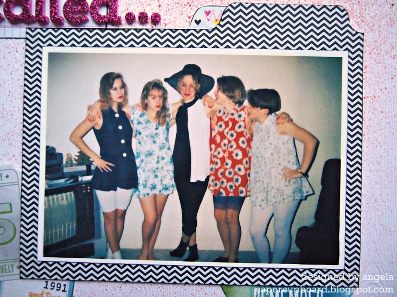
WARNING: Somewhat-embarassing early-90s fashion ahead...you've been warned.

Hey there, y'all! While I have a big old backlog of projects I could/should be sharing with blogland, instead I have a brand-new one today -- I just made it yesterday, and the photos are hot off the camera! 


A bit of background: I've been taking the above online class from Shimelle Laine that's winding down now, and it's really helped me rethink where I put pages in my albums and where my blank spots are -- one of my biggest blank spots is my earlier (not-as-cute-as-a-baby-but-instead-rather-awkward-tween-and-teen-) years, so I've been finding favorite older photos to scrap lately. This one called to me from the old shoebox 'o photos:


Oh man, didn't I warn you? Here, you see me with four of my 9th-grade pals (I'm in the orange - shocking, I know), and we're all modeling stylish ensembles from my very own closet in my very own living room during one of my very own sleepovers. Note, please, the lace-trimmed bike shorts and leggings with those babydoll dresses, the floppy hat on my friend Becky, the bangs. Oh, the bangs. (you could also note the original Nintendo unit, which Andrew and I still have AND which still works, believe it or not!) How could I resist scrapping this photo? 

A photo like this called out for something funky and fun, so I turned to my Amy Tangerine Sketchbook collection, which I Lurve. Loaf. Love, and used it:


Quite minimal for me, really. I dig it, though. The Mister Huey splatters and inked edges grunge it up a bit. I could get hooked on using little skinny paper bits as a page border.


...and it wants those outfits back! I used the Bits from the line here and as embellishments around the photo. Thickers are also from the same line -- relatively un-messy glitter is a good thing. The cardstock is very nice white woodgrain stuff from Studio Calico.


The photo mat is a pocket that holds my typewritten journaling (on a grid index card -- yay for cool, cheap office supplies), and the thread I used here and elsewhere is actually neon pink, but neon just doesn't photograph well, does it? With a few exceptions, everything came from Scrappy Chic (as usual), but it's also at 2peas and stuff too if you aren't local.

And now for a shout-out for my scrappy friend Sue, who inspired this post by quite rightly noting that the card in my last post was rather Tangerine-esque in its watercoloriness. Thanks, Sue, and congrats on being named to the Get it Scrapped! Creative Team -- that's so awesome! You can read about it at her blog (linked above) and here.

I'll be back with another layout using this line -- one that's an absolute riot of color and pattern. Yay!

Enjoy your day!

01 June 2012

Wait....what? (and FWF)

Since this is a FWF post, most of you are probably just dropping by to see the Unity project...but for the rest of you: I'm back! After an almost-3-month blogging hiatus, I finally found the bug again. My creating bug didn't go anywhere (you should SEE all the layouts I've been cranking out), but the whole photo-editing-writing-uploading-commenting thing was wearing on me for some reason. I missed having an audience of crafty blog friends, though. Happy to be back. :)

Ok, enough of that. How about a card?


I made this one a month ago for our godson's 7th birthday (Can't believe he's SEVEN! That's insane). I actually started by stamping a whole 9x12" sheet of watercolor paper with the bike background from April's Kit of the Month in Staz-On. Then I broke out my old-skool Crayola watercolors (you know, the little oval pans in the plastic case?) and randomly added citrus-hued blotches over the bikes. It made me happy to get all painty! I trimmed out a panel for my card front and drew the frame around it.


I almost never do sticker sentiments on cards for some reason, but I needed something that would really stand out, so I turned to my trusty October Afternoon alphas. The little banner-y things underneath that are the ribbon part of the blue ribbon punch from Jenni Bowlin, made from a handful of scraps that were on my desk. Stickers and punch are both from Scrappy Chic. A couple black accents and I called it good.

Hope you all enjoy your weekend, and I really do think I'll be back soon with more.

22 February 2012

Authentique x2

Me again, looking up briefly from my (larger-than-usual) mountain of essays to grade. Luckily, I made these layouts before the landslide :)

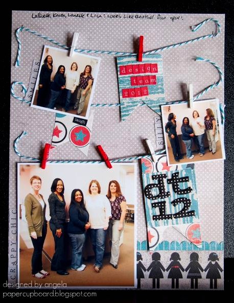
These two also feature the latest goodies from Scrappy Chic, namely the Celebrate collection from Authentique. Here, I'm celebrating a new Design Team year -- check it:


Aw, ain't we cute? I wanted to use a PageMaps sketch that's kinda been stuck in my head (it's one from January if you'd like to go hunting), and I also wanted to break out a bit of stash in addition to my new goodies. In this case, I went with some tiny clothespins from Canvas Corp. that had been sitting in a jar since I won them a year ago or more -- oops!

(other supplies: May Arts twine, AC Thickers, tiny attacher)
I think this picture is hilarious. From what I can tell from my first time meeting these ladies, this is a pretty good representation of their personalities :) Looking forward to checking out their creations all year long.

Since I had a good mess going already, I thought I'd whip up a second quick layout:


Different, no? Very manly. Aside from the background, I used mostly scraps to document my husband's favorite watch. An odd subject, maybe, but he really loves this watch, and I really love this picture. (I also love the potty people paper, by the way -- reminds me of a certain stamping pal of mine). Also, if I may get design-y for a minute, I like the way the strong diagonal line in the photo leads the eye to both the journaling in the top corner and the buttons in the bottom. Meant to do that. Yep.

(other supplies: AC Thickers)
I even used my twine scraps to thread those buttons. Not easy -- that May Arts twine is thick! Pretty, though.

Anyway, that's it for my DT creations this month -- next month we'll pick up speed, since CHA goodies are pouring into the store now. (Don't forget: you can keep tabs on what's coming in on the store blog here.) I grabbed some fun Dear Lizzy papers and stamps the other day, and I can't wait to break 'em out.

After the dang essays. Blergh.

Have a lovely evening!

19 February 2012

Challenges all around

Howdy there -- hope you're having a lovely Sunday, wherever you may be.

February marks the start of a new year for the design team over at Scrappy Chic (you can see us all here...or in an upcoming blog post right here, if you're patient). One of the lines in my kit this month was Tiny Woods from KaiserCraft (yes, that's really the name. yes, I think it's funny. sometimes I have a seventh-grade sense of humor.)

This line has really lovely colors, but they're challenging -- fall-ish (makes more sense in their home country of Australia than here, I suppose), and it's borderline theme-y, design-wise. So, I challenged myself to make at least two layouts using it, and I turned to a couple of online challenges to get it all done. Whoa. Challenging, indeed.

Here's the first take:


Analog memories, indeed. Andrew has a lot of fond memories of this old tape recorder -- high technology back in the day! I thought the vaguely 70s colors of the paper were perfect for this particular topic.

I used Studio Calico's Sunday sketch from last week to help me out:


By making the shift from 12x12 to 8.5x11, I had to squish some elements, bumping the journalling below the title instead of next to it. Otherwise, I was (surprisingly) faithful to the original.

other supplies: ranger tag, pebbles alphas, cosmo cricket tiny type word, twine, bazzill cs, amy tangerine washi tape

The tag with my title on it is misted very lightly with Mister Huey's Clover, and I typed up my journalling on the B-side leftovers of my main paper. The buttons are chipboard from Bazzil, and I misted the heck out of those with the same Clover color. Did you know that Scrappy Chic will be carrying Mister Huey's any day now? That makes me very happy.

While I was at it, I tackled the challenge from The Creative Type to scrap your celebrity crush. How fun is that? The samples on their blog are great, too. I had no trouble at all choosing my crush -- the hardest part was choosing a photo from the interwebs. Here's what I came up with:

other supplies: authentique alphas, studio calico stickers, signo pen, kaisercraft really tiny alphas, doodlebug flock (under the stickles, dang it)

Oh, Paul Rudd, how is it that such a funny dude can smolder at the camera that way? Sigh. Anyway, you can see I used the same paper as above, plus a subtle woodgrain pattern. I'm less than pleased with my splatters -- the blue were supposed to be flocked, but the flock didn't stick well enough, so I had to do a second coat with Stickles. And then, when I was setting the thing up for photographing (almost 24 hours later, by the way), I smeared the white splatters (dang you, OA Sprinklers!). So, whatever. I still like the end result, warts and all. I'll just skip the close-up, ok?

In the end, my challenge-based layouts made the challenging paper line less of a challenge. Dig? Dig.

Feel free to go watch a Paul Rudd movie now. Enjoy!

16 January 2012

ooh, sparkly :)

Hey there!
I'm still working on the dang December album photos (all 80 of them...each of which is inexplicably rotated 90 degrees...blergh. Any insight on doing batch editing in Picnik?).

So, in the meantime, how about something new?

{Warning: slightly mushy photo ahead!}


Oh geez, are those people smooching? And is one of them me? Why yes, that's what you see here. It was midnight on New Year's Eve, one of very few times I condone brief PDA. So I scrapped it, using my latest goodies from Scrappy Chic, namely the Yours Truly line from Echo Park. I had to grunge it up a bit with ink to make it work with the background, which I made all by my lonesome, using some vintage pattern tissue (scrunchily adhered to cardstock with spray adhesive) that I stamped a bit (using these new Hero Arts stamps) and then topped with a coating of glitter spray. (If you use this stuff, put your project in a box and go outside -- it isn't too messy, but there's definitely overspray...you know, made of glitter, so it's gonna get everywhere otherwise).


You can see the glitteriness a bit better here -- even more if you click to enlarge. I adhered some twine behind the photo mat in messy loops just for kicks.


This might be the first time I've used something other than alpha stickers for a title, but this cut-apart element from the EP line said just the perfect thing :). You can see another Hero Arts stamped heart peeking out the side there, too.

So, I've been using scrapping as an escape from an otherwise so-far busy semester, which means you'll be seeing some more pages soon. And the dang album. One of these days.

Until then, have a lovely, hopefully-not-too-cold day!

31 December 2011

What the heck?

Where on earth have I been? I know I'm in good company in not blogging much during the holidays, but I haven't blogged AT ALL in weeks! I've missed my bloggy friends!

I've been inspired by some year-in-review project posts, so I think I'll do one of those soon. (See here and here for some inspiring cards from my craft pals!). I have also been keeping up with my Big Fun Christmas journal (see here and here for its humble beginnings), and I'll get some photos of that soon to share. 

For now, though, will you settle for a layout? Thanks!


This photo is from the wedding (duh) of a couple of sweet kids. I can say that they're "kids" because one of them is my husband's former student! We've become pals in the intervening years, and were honored to attend their wedding. Don't you love this photo of them? They're so cute.


I made excellent use of my ever-expanding washi tape collection here, creating a shiny/patterned/textured background for my title and caption. The paper collection is My Mind's Eye's very pretty Love Me, part of my long-neglected December kit from Scrappy Chic.


I fussy-cut some banner flags from my extra paper, popped them up on foam, highlighted the hearts with stickles, and then "strung" some twine all over the place (it's glued down, which was easier to do than I thought it would be). I think the swirly lines break up all the straight lines from the tape. In my head, anyway. Wanna see a secret?


More photos! I had a handful of not-great shots that still helped tell the story of the night, so instead of featuring them, I created a little accordion fold right in the middle of the layout. I'll definitely try this trick again!


I had some leftovers, so I combined them with that pretty plaid pattern from the same collection for a quick card. The stamped twill started out white, but I inked it up with some Distress Stain (spun sugar, from my stocking!) before stamping and adhering it. Stamps are from this Studio Calico/Hero Arts set, also sourced from Scrappy Chic.

Local folks, have you been up to the store since their big expansion/re-organization? I love it! So spacious-feeling and much better-lit. Can't wait to get up there for a crop!

Well, it's good to be back. I hope you all have a very happy and crafty 2012! Happy New Year!

05 December 2011

Sure could use a little...

...Peace, that is.

Man, is it busy around here! The usual holiday bustle, plus some non-holiday bustle, plus plenty of school bustle (the end-of-semester grading binge is officially underway).

So, for a moment, peace:


This was my "personal challenge" line from my Scrappy Chic kit - it's BoBunny and absolutely lovely, but also very busy and glittery...plus the kraft-brown-blue-snowflake combo was a bit perplexing. I tried to find some peace in all that busyness, and I'm pretty pleased with the result. The tree stamp above the title is the same one I used on the ornament in the photo (shall I call it craft continuity? I think I just created a new concept).


It's a little hard to see, but some of the trees have distress stickles on them -- the subtlest of all glitters, in my book. I love those letters -- they're from Pebbles and are perfectly matte.


I kept the busiest patterns to smaller accents, but the glitter definitely still stands out -- in a good way, though. A twine bow finishes it off.

Here's to peace. Have a lovely day!

01 December 2011

CHA mini album (finally!)

So, remember way back in July when I had such fun at CHA in Chicago? And I was all geeked about making a mini out of my photos? Well...sometimes time just slips away from us.

But! No longer! Here it is!

I started with a Maya Rd. chipboard binder that is kind of like this one, only a bit bigger. I got mine at Scrappy Chic (where they're having another yard sale this Sunday [buy my stuff! get great deals!]).

In honor of my favorite line from CHA, almost all the papers and embellishments are from the Amy Tangerine line by American Crafts. Still love it, by the way.

So, away we go! Click to enlarge any of the collages:
Cover: lots of misting, along with Amy Tangerine fabric paper, Thickers, tape, and accents, plus OA mini alphas. Tip: to use tape on top of fabric, just lay it down over some stronger adhesive. I used scor-tape, and it worked great!
Inside pages, part one: things we did.
Pages are misted, then layered with photos, tape, stickers, and other accents. I included my name badge, too.
Inside pages, part two: people we met. The last page is a photo of the city skyline as we were driving home.

I haven't really added any journaling. I might just throw in people's names or list events or something. Nothing too tricky -- after all, it took all these months just to make the thing!

Anyway, now it's December -- how did that happen? I'll be getting started on my Big Fun Christmas Project any moment now (I've been impatiently waiting!). Do you have any special holiday crafting plans (for yourself or for gifts?) Let me know!

Until then, I hope you have a lovely day!

23 November 2011

Happy (almost) Thanksgiving!

Whether you're in the US or not, it's always nice to pause and think about all the good things to be thankful for. And if you ARE in the US, well...why not stuff yourself silly too? That's right, tomorrow is Thanksgiving here, and besides the thankfulness and all the great chow in store for me tomorrow, Thanksgiving is also prime crafting time.

For most big holidays, I make tags for my family. This year, I got all Tim Holtz-happy and broke out my underutilized TH embossing folders, along with about 5 different colors of Glimmer Mist, three styles of 7gypsies tape, and some Prima leaves to make these:


Ooh, pretty. :)


After the mist dried, I hit each tag with some Distress Ink (using one of the foam applicator thingies) to catch the highlights of the embossed designs.


All the ribbons were pulled sort of randomly from my stash -- I just picked fall-appropriate colors.


Those flowers look like the ubiquitous rolled-ribbon flowers, but I actually made them with strips of vintage pattern tissue - it works the same as ribbon, I just had to be a little more delicate as I twisted to keep the paper from tearing.  The stamps are from Waltzingmouse, and they're conveniently placed to disguise the seam in the embossing (my tags were bigger than my folders, so I flipped them around and embossed the bottom inch or so separately).


The back features my favorite tiny gnome (and an appropriate sentiment) from this Unity stamp set (their big sale ends today, in case you were looking to spend some dough). The papers on the back are all from We R Memory Keepers' Autumn Splendor collection.

Everything you see here (except the Waltzingmouse stamps) came from Scrappy Chic -- some recently, some from days past. Their big sale starts Friday, in case you were looking to spend some MORE dough (and at a locally-owned small business, natch).

I had fun getting all misty and inky and stuff making these, and I hope the fam digs them, too!

Time to get back to the oven -- one more dessert to go, and my contributions to the feast will be complete. Yum. I'll get photos, don't you worry.

Have a lovely day, and have a great Thanksgiving, wherever you may roam.