storage for my paper projects...come take a look!
Showing posts with label andrew. Show all posts

09 July 2012

one line, two ways - part two

Hello again!
Today I have more layouts from my June kit from Scrappy Chic -- and once again, I made two rather different layouts with just one line of paper. This time around, it's KaiserCraft's Check In, which is ostensibly a travel line, though calling these "travel" pages would be a stretch, for sure!

First up, a page about one of my husband's choirs - 


How considerate of them to match my papers so well with their red and black performance outfits. ;) This color scheme pretty much wrote itself, and I used one of my favorite go-to layouts: trim the patterned paper to size, cut it into two pieces, and flip one of them. Done. The embellishments keep it looking fresh -- here I used some of the perforated elements from the line, plus a border punch, some ribbon, and black alphas that almost match the patterned paper.


I also turned to Jenni Bowlin (queen of red and black) and grabbed some gems and butterfly stickers from my J.B. stash, along with a new stamp set from Maya Rd to house a bit more patterned paper. Andrew actually liked this one so much he took it into school to show the kids in the choir -- isn't that sweet?

For my second page, I went in a different direction, color-wise:

This actually looks busier in the photo than it does in real life, I swear -- but here, I scrapped Andrew's childhood love for an antique traffic signal. Yep. The big, awesome historical museum near us recently redid their whole transportation exhibit (and in Detroit, transportation exhibits are kind of a big deal), and Andrew was worried that his traffic light wouldn't be part of the refurbish...but it was. Happy boy. So this time around, I used the road and ticket images from the line to fit the nature of the museum's exhibit rather than a real road trip.


Those tickets come from the line, and I added some more Jenni Bowlin stickers (since they were on my desk), plus some punched circles from one of my favorite Hambly transparencies (RIP :( - I'll miss them).

Well, that's enough words from me for one day, don't you think? You can see these projects and get your hands on the products I used at Scrappy Chic -- as always!

{Ok, one more thing: I'm fortunate enough to be headed off to CHA for a second time! We'll be heading out early for some pre-show events, and then I'll be right in the thick of things once again -- I can't wait! So, I'll likely be posting some quick and photo-heavy posts while I'm there...if there are any lines, projects, or people you'd like to see more or less up-close, be sure to let me know! In the meantime, you can access a great list of all the sneak peeks here -- they're starting to come in pretty heavily this week!}

Have a great Monday!

19 June 2012

giu (x2), day two

Welcome back to the blog! For today's Growing in Unity post, I have a goofy layout and a simple card for you. First up, a layout about my goofy boy -- give him a prop and he'll pose! Take a look:


You can read about the "kit" I used to make most of my projects this week in yesterday's post. Today, I used several stamps from this KOM on my layout -- I love the wide (almost random) variety in each kit -- so many options! By the way, I just noticed that this particular set is on sale at the moment -- for super-cheap!


I wanted to add more color to the upper corner of my layout, so I paper-pieced the banners using some scraps, while the glasses are just stamped right on my background. I know lots of scrappers fear stamping right on their layouts, but if you can stamp on a card, you can stamp anywhere -- plus, if you smudge or smear, well, that's what layering is for, right?


I also pieced the little camera for an additional colorful embellishment in the opposite corner. Simple! While I had that particular stamp set out, I made a relatively quick one-layer card:


The diamond background was pretty easy to use as a background (with the help of a stamp positioner). I added clouds from this Bella Blvd. co-brand set to house my sentiment (which, yes, is smudged a little...maybe I'll layer another cloud over it -- problem solved!).


Cute little chicks, ready to celebrate. Hope you've enjoyed today's projects, and be sure to comment today and all week for your chance to win some Unity goodness of your own. Have a great day -- see you tomorrow!

18 June 2012

giu (x2), day one

Happy Monday! If you're here for the first time, welcome -- it's my Growing in Unity week. All week long, I'll be posting projects featuring Unity's fun and funky designs.

I decided to give my week a little twist -- everything you'll see here was made from the kit I put together for this month's Counterfeit Kit Challenge. You can read the suggested guidelines for this month's kit here -- it's a DIY affair inspired by one of my favorite scrappers, Shimelle Laine. I used less paper than the guidelines ask for...but more (way more) stamps, of course! I used my kit to make two projects for you today.

So, let's get on with it. How about a layout featuring my two favorite boys?


I started with some orange mist and cardstock, including some cool resist cardstock from Stampin' Up that's been in my stash for ages. The rub-ons at the bottom are equally old :) But of course, you're here for the stamps:


I love how scrap-friendly the Simple Stories co-brand stamps are! Here I used one from the year-o-graphy line layered with some ribbon and bling.


I also stamped the Life Bingo stamp on the same cardstock as the photo mat, because I thought the resist would look nifty.

Since I had some of that resist cardstock left over, I used it to make a summery card:


More Simple Stories stamps here -- this time, I used Sweet Summer Memories for the sun and sentiment. The "water" is just masked and misted with three shades of blue, and the "sand" at the bottom is some corrugated paper packaging I saved from the recycle bin :).


The whole card is also misted with Mister Huey's Shine for a subtle shimmer...which is so subtle you can barely see it here!

Ok, I think that's enough for one day -- but don't worry, I'll be back with more tomorrow! Remember to leave comments all week long for a chance to win two itty bitty stamps of your very own!

Enjoy your day :)

27 February 2012

Where the rapids are grand.

Happy Monday, y'all!
We had a busy weekend (taxes - fun! cleaning - funner! grading - funnest!). I'm down to one pile of essays, so I'm feeling a bit less stressed on that front. Whew!

That's not what you're here for, though, so how about a mini? A month ago, Andrew and I went upstate to Grand Rapids for a few days -- he had a conference, and I usually go along. The rapids haven't been grand for something like a century (they wanted to use the river for commerce, after all), but the city itself is pretty nifty.

Before we left, I decided I'd like to document our trip, so I threw together this mini from, essentially, the scraps that were in reach! The cover is leftover Kraft Funday from MME, on which I embossed the title (love that Lawn Fawn alphabet!) and did a bit of mist splattering. The whole thing is about 5x6 or so.
Inside the cover, I adhered a section cut from a bag -- as you'll see, Vertigo Music is one spot we try to hit at least twice whenever we're in town.
{click any photo to enlarge}
Here's a few of the inside pages -- while we were on the trip, I adhered everything but the photos (I'm not that hardcore -- no travel-sized photo printer for me!), but I did put in little notes indicating which photos went where. I took a couple rolls of fun tape, little scissors, my Smash pen (which has a glue stick on one side), scraps of paper and cardstock, some small letter stickers, and a bunch of labels from Martha Stewart's collection at Staples. Everything, including the album, fit into about a quart-size ziploc. Simple! Clockwise from top left: my favorite photo (and the last one we took) at HopCat, some photos and ephemera from the Public Museum, a handful of photos from Vertigo (I had a lot to choose from), a couple random photos along with some ephemera from the conference.
Here, you can kinda see how I made the album itself -- basically, I cut some scraps down to vaguely-appropriate sizes and then scored and stitched them right down the middle. They aren't all the same size, which I think is kind of interesting. Additional flaps and smaller pages were stitched in afterwards (didn't want to kill the sewing machine, after all). I even stitched in a little glassine bag from a Thai takeout place once we got home, which you can see in the second photo.
I tied some of this twine around the spine to emphasize the travel-y-ness, and stamped the date here on the back. There's something about the variety of page shapes and patterns that makes this a lot of fun to look through -- and it came together so easily! I just spent a few minutes on it each morning in the hotel room, then printed and added the photos when we got home. I liked preserving the memories while they were still fresh, and this is something I'll definitely do again. Yay!

Ok then, time to get back to the real world. Have a great day!

22 February 2012

Authentique x2

Me again, looking up briefly from my (larger-than-usual) mountain of essays to grade. Luckily, I made these layouts before the landslide :)

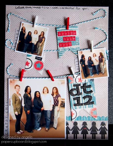
These two also feature the latest goodies from Scrappy Chic, namely the Celebrate collection from Authentique. Here, I'm celebrating a new Design Team year -- check it:


Aw, ain't we cute? I wanted to use a PageMaps sketch that's kinda been stuck in my head (it's one from January if you'd like to go hunting), and I also wanted to break out a bit of stash in addition to my new goodies. In this case, I went with some tiny clothespins from Canvas Corp. that had been sitting in a jar since I won them a year ago or more -- oops!

(other supplies: May Arts twine, AC Thickers, tiny attacher)
I think this picture is hilarious. From what I can tell from my first time meeting these ladies, this is a pretty good representation of their personalities :) Looking forward to checking out their creations all year long.

Since I had a good mess going already, I thought I'd whip up a second quick layout:


Different, no? Very manly. Aside from the background, I used mostly scraps to document my husband's favorite watch. An odd subject, maybe, but he really loves this watch, and I really love this picture. (I also love the potty people paper, by the way -- reminds me of a certain stamping pal of mine). Also, if I may get design-y for a minute, I like the way the strong diagonal line in the photo leads the eye to both the journaling in the top corner and the buttons in the bottom. Meant to do that. Yep.

(other supplies: AC Thickers)
I even used my twine scraps to thread those buttons. Not easy -- that May Arts twine is thick! Pretty, though.

Anyway, that's it for my DT creations this month -- next month we'll pick up speed, since CHA goodies are pouring into the store now. (Don't forget: you can keep tabs on what's coming in on the store blog here.) I grabbed some fun Dear Lizzy papers and stamps the other day, and I can't wait to break 'em out.

After the dang essays. Blergh.

Have a lovely evening!

19 February 2012

Challenges all around

Howdy there -- hope you're having a lovely Sunday, wherever you may be.

February marks the start of a new year for the design team over at Scrappy Chic (you can see us all here...or in an upcoming blog post right here, if you're patient). One of the lines in my kit this month was Tiny Woods from KaiserCraft (yes, that's really the name. yes, I think it's funny. sometimes I have a seventh-grade sense of humor.)

This line has really lovely colors, but they're challenging -- fall-ish (makes more sense in their home country of Australia than here, I suppose), and it's borderline theme-y, design-wise. So, I challenged myself to make at least two layouts using it, and I turned to a couple of online challenges to get it all done. Whoa. Challenging, indeed.

Here's the first take:


Analog memories, indeed. Andrew has a lot of fond memories of this old tape recorder -- high technology back in the day! I thought the vaguely 70s colors of the paper were perfect for this particular topic.

I used Studio Calico's Sunday sketch from last week to help me out:


By making the shift from 12x12 to 8.5x11, I had to squish some elements, bumping the journalling below the title instead of next to it. Otherwise, I was (surprisingly) faithful to the original.

other supplies: ranger tag, pebbles alphas, cosmo cricket tiny type word, twine, bazzill cs, amy tangerine washi tape

The tag with my title on it is misted very lightly with Mister Huey's Clover, and I typed up my journalling on the B-side leftovers of my main paper. The buttons are chipboard from Bazzil, and I misted the heck out of those with the same Clover color. Did you know that Scrappy Chic will be carrying Mister Huey's any day now? That makes me very happy.

While I was at it, I tackled the challenge from The Creative Type to scrap your celebrity crush. How fun is that? The samples on their blog are great, too. I had no trouble at all choosing my crush -- the hardest part was choosing a photo from the interwebs. Here's what I came up with:

other supplies: authentique alphas, studio calico stickers, signo pen, kaisercraft really tiny alphas, doodlebug flock (under the stickles, dang it)

Oh, Paul Rudd, how is it that such a funny dude can smolder at the camera that way? Sigh. Anyway, you can see I used the same paper as above, plus a subtle woodgrain pattern. I'm less than pleased with my splatters -- the blue were supposed to be flocked, but the flock didn't stick well enough, so I had to do a second coat with Stickles. And then, when I was setting the thing up for photographing (almost 24 hours later, by the way), I smeared the white splatters (dang you, OA Sprinklers!). So, whatever. I still like the end result, warts and all. I'll just skip the close-up, ok?

In the end, my challenge-based layouts made the challenging paper line less of a challenge. Dig? Dig.

Feel free to go watch a Paul Rudd movie now. Enjoy!

14 February 2012

Happy Valentimes!

No, that's not a misspelling. Well, it is, but an intentional one. More on that in a sec.

In the meantime, I thought that after what, three or four weeks of bloglessness, it was high time to get back on track. And since it is indeed Valentine's Day, how about a look at the card I whipped up for my sweet husband?


Aside from paper, there are very few things I love more than beer. Turns out, my hubby is one of them!

I figured it was high time I broke out my cute Lawn Fawn stamps -- love that polaroid frame (thanks, Em!), and the outline alpha set makes me happy. Paired with a bit of stickles, some Echo Park papers and a pint of beer, I think this is one cheery Valentine. (Gold star to the first person who can tell me where my "pint glass" is from!)

In other news, a new Design Team year has just begun over at Scrappy Chic, and I have a brand-new team of ladies to work with. Exciting! Keep your eyes peeled for projects made from great new CHA products soon.

Now, back to the "Valentimes" -- if you're a 30 Rock fan, you already know what I'm talking about, and if you're not...I'm not sure we can be friends. Kidding! But it's really, really funny.


If that image doesn't jog your memory (What, not everyone knows Vlem the prostitute?), feel free to watch an oddly-spliced 30 Rock clip here. Rachel Dratch's cameos are always memorable.

All right then, I hope you all have lovely plans with your sweeties today. If not, I hope you have plans with some paper!

Have a lovely Valentine's Day!

20 January 2012

FWF and a layout.

Good (cold) morning!

If it's Friday, it must be time for some Flair. Be sure to check out the Unity blog to see what the big deal is today. In the meantime, how about a little stamp action on a layout?


Aww, ain't we at least a little cute? This photo was taken right after the one in this layout, so of course we look happy ;). I love simple designs like this one -- easy to use over and over again, changing the feel by changing the supplies used.

Speaking of supplies, check out the Unity goodness there near the bottom!


Before I adhered the block of heart-print paper, I sketched a quick line at the bottom, moved it out of the way, and then used the line as a guide to stamp the dashed scallop repeatedly, masking the side edges and offsetting the rows (did it freehand, even. imperfections are fine with me!). The sentiment makes perfect sense, seeing as this photo is from midnight on New Year's Eve.


A glittery button-twine star, stitching around the border and around the photo, and some various tapes and stickers and such, and all is well.

Hope you enjoy the rest of the Unity goodness out there. Have a lovely day!

other supplies: Crate Paper (Paper Heart, Random) papers and border sticker, AC Thickers and tape, Hambly and Tim Holtz tapes, Best Creations glitter paper, October Afternoon button, Twinery twine, Tim Holtz tiny attacher, Stampin' Up punch and ink, and Colorbox ink.

16 January 2012

ooh, sparkly :)

Hey there!
I'm still working on the dang December album photos (all 80 of them...each of which is inexplicably rotated 90 degrees...blergh. Any insight on doing batch editing in Picnik?).

So, in the meantime, how about something new?

{Warning: slightly mushy photo ahead!}


Oh geez, are those people smooching? And is one of them me? Why yes, that's what you see here. It was midnight on New Year's Eve, one of very few times I condone brief PDA. So I scrapped it, using my latest goodies from Scrappy Chic, namely the Yours Truly line from Echo Park. I had to grunge it up a bit with ink to make it work with the background, which I made all by my lonesome, using some vintage pattern tissue (scrunchily adhered to cardstock with spray adhesive) that I stamped a bit (using these new Hero Arts stamps) and then topped with a coating of glitter spray. (If you use this stuff, put your project in a box and go outside -- it isn't too messy, but there's definitely overspray...you know, made of glitter, so it's gonna get everywhere otherwise).


You can see the glitteriness a bit better here -- even more if you click to enlarge. I adhered some twine behind the photo mat in messy loops just for kicks.


This might be the first time I've used something other than alpha stickers for a title, but this cut-apart element from the EP line said just the perfect thing :). You can see another Hero Arts stamped heart peeking out the side there, too.

So, I've been using scrapping as an escape from an otherwise so-far busy semester, which means you'll be seeing some more pages soon. And the dang album. One of these days.

Until then, have a lovely, hopefully-not-too-cold day!

02 January 2012

My top 10 of 2011 -- sort of.

Hello again, all!
Now that the new year is in full swing (or as full swing as it can be on day two!), I figured it was time to take a stroll through last year's projects and pick my favorites.

My original goal was to pick 10 cards and 10 layouts...but as I was scrolling through a year's worth of blog posts, I realized I made a boo boo -- I think I might have deleted a couple of older Picasa web albums...not a big deal, except a few month's worth of blog photos were in them. Oops!

So, I'll just go with ten total projects instead, with a big date gap in the middle. Without further ado, here we go!

From February:
A layout featuring my pal's sweet dog. Read more here.

Jump to June:
Baby predictions, the old-fashioned way. See original here.

 The first card I had published. Never gets old. Read more.

In July:
Simon is about 12x this size now. Still cute. See details here

From my Growing in Unity week. Original is here

in August:

More kitten, with banners this time. Close-ups here

My sweet man's birthday. One-layer happiness here.  

October:

Still love this mini. All the pages are here

Stepped into a new style and surprised myself. Spongeworthiness here

November:

Got a little lost in an 8-layout post, but man, I love this one. And yes, more kitten. See them all here

So, what can we conclude? I definitely like to scrap animal photos, especially of Simon. (Dex got attention too...I swear!) Also, scrappy projects just barely outnumber card projects, which I'm pretty sure reflects my creative output last year. I like patterns a lot, but no one color dominates. Nor does a single style, which either makes me versatile or mildly schizophrenic. I'd prefer versatile, though ;) And I definitely shouldn't delete web albums willy-nilly! 

I can also say with some confidence that my December album (aka the Big Fun Christmas Project) will be one of my favorites as well -- but as I finished it yesterday, it's technically a 2012 project. You'll see it soon...and again in the 2012 year in review!

Hope you're having a great day!

21 November 2011

Hip Holiday layouts

Ok, maybe these layouts aren't hip, but they do feature Hipstamatic photos...have I mentioned lately how much I love taking photos with that delightful little iphone app? It makes everything look festive/artsy/skillful without trying too hard at all. 

I wanted to scrap two very blurry photos of one of Andrew's choirs singing at last year's holiday concert. Here's an explanation of the event:


And here's the whole layout, using Prima's awesome and quirky holiday collection, North Country. It's very un-Prima, which is good for me -- as you know, floral girly stuff and I are not the best of friends (Look! Did you notice I used a flower right smack on this layout? I impressed myself with that one!). I ganked the layout design from a layout in this post, which was based on a layout from Shimelle's Pretty Paper Party class (whew!). Yes, "gank" is a word, though CASE would probably be a better option.


It's a little hard to see in the photos, but I layered some red tulle trim under the photo edges as well as under a Hambly transparency strip -- since tulle is so lightweight, it didn't add much bulk, even though it's all pleated and stuff. Ooh, and speaking of ganking, I totally ganked the title from the musical Mame:


Yet another song to get lodged in your brain. Enjoy. :)

One more layout today, this one featuring some Webster's Pages paper from the Botanical Christmas collection:


Kept it simple, since the Webster's paper is so pretty all on its own. I like that I unintentionally ended up with a visual triangle of trees, though :). My favorite part is the bow, which I made with some ribbon from my stash that I'd had forever:


The bow-y part is made the same way as the one on this card, only with a loop of ribbon instead, and then I just added the short tails behind and the long bit behind the pictures -- 4 separate pieces of ribbon come together so neatly, eh?


A little Stickles on the top of the tree, some alphas from Basic Grey and Studio Calico, and I called it a day! These layouts are out for the viewing at Scrappy Chic, if you're curious to see them in person. They have some great Black Friday (and Small Business Saturday) sales planned, so shop well!

Speaking of "calling it a day," today our second bathroom got torn apart (thanks Dad!) -- it's reno time. On top of that, I made mac and cheese for Thanksgiving, along with a batch of ice cream from this fabulous book -- seriously, this chick has her ice cream science down!! Oh, you know, plus I worked and stuff. Busy day!

Hope yours has been lovely! I'll be back (maybe) Wednesday with my family tags for Thanksgiving. Hooray!