WARNING: Somewhat-embarassing early-90s fashion ahead...you've been warned.
Hey there, y'all! While I have a big old backlog of projects I could/should be sharing with blogland, instead I have a brand-new one today -- I just made it yesterday, and the photos are hot off the camera!

A bit of background: I've been taking the above online class from Shimelle Laine that's winding down now, and it's really helped me rethink where I put pages in my albums and where my blank spots are -- one of my biggest blank spots is my earlier (not-as-cute-as-a-baby-but-instead-rather-awkward-tween-and-teen-) years, so I've been finding favorite older photos to scrap lately. This one called to me from the old shoebox 'o photos:
Oh man, didn't I warn you? Here, you see me with four of my 9th-grade pals (I'm in the orange - shocking, I know), and we're all modeling stylish ensembles from my very own closet in my very own living room during one of my very own sleepovers. Note, please, the lace-trimmed bike shorts and leggings with those babydoll dresses, the floppy hat on my friend Becky, the bangs. Oh, the bangs. (you could also note the original Nintendo unit, which Andrew and I still have AND which still works, believe it or not!) How could I resist scrapping this photo?
A photo like this called out for something funky and fun, so I turned to my Amy Tangerine Sketchbook collection, which I Lurve. Loaf. Love, and used it:
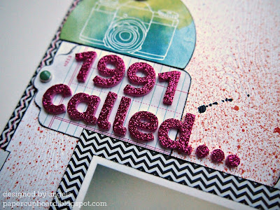
Quite minimal for me, really. I dig it, though. The Mister Huey splatters and inked edges grunge it up a bit. I could get hooked on using little skinny paper bits as a page border.
...and it wants those outfits back! I used the Bits from the line here and as embellishments around the photo. Thickers are also from the same line -- relatively un-messy glitter is a good thing. The cardstock is very nice white woodgrain stuff from Studio Calico.
The photo mat is a pocket that holds my typewritten journaling (on a grid index card -- yay for cool, cheap office supplies), and the thread I used here and elsewhere is actually neon pink, but neon just doesn't photograph well, does it? With a few exceptions, everything came from Scrappy Chic (as usual), but it's also at 2peas and stuff too if you aren't local.
And now for a shout-out for my scrappy friend Sue, who inspired this post by quite rightly noting that the card in my last post was rather Tangerine-esque in its watercoloriness. Thanks, Sue, and congrats on being named to the Get it Scrapped! Creative Team -- that's so awesome! You can read about it at her blog (linked above) and here.
I'll be back with another layout using this line -- one that's an absolute riot of color and pattern. Yay!
Enjoy your day!


5 comments:
Such a fashionista! This layout suits your photo perfectly. What fun!
Wow, thanks for the shout-out and links! So kind of you and much appreciated! Great layout, love the look back. And strips of paper as a border are a favorite of mine, too!
p.s. I'm meeting with Chris tomorrow about possibly teaching a class at Scrappy Chic! Kinda exciting and scary at the same time. We'll see what happens....
Oh that brings back the memories! I think I have a few pictures that look a lot like this. I too had lots of the lace trimmed bike shorts with long shirt outfits. We were so stylish ;)
So cool! I love the misting, tabs and glitter thickers. Have I mentioned lately how you make me want to buy everything you use? :D
The details that you put into your layouts always amazes me and brings a smile to my face! They are like boxes of Cracker Jacks...there is a surprise in every nook! The layout title has me in a fit of giggles...reminds me of some great times/outfits myself! Thank you for the wonderful flashbacks :D
Post a Comment