Well, hello there! You've made it to the end of my Growing in Unity week, and I've had a lot of fun. I hope you've enjoyed the projects I've shared this week. Today, I have just one project for you, but it's a bit...busier...than some of the others I've shown you. Plus, it features both of our cats, so that should make Linds happy! ;) Don't forget to comment today and on the rest of this week's posts for a chance to win two Unity itty bitties of your very own -- more details on that at the end. Ok, let's go:
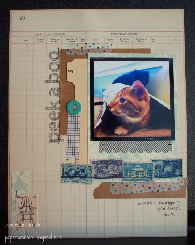
Hello, pattern-mixing! I realized I had this sheet of bird-print paper in my Counterfeit Kit (see more in Monday's post), and it's one that I was determined to use, so I made it the background for this page about my cats, who battled each other for the sunniest (and best bird-watching) spot in the house.
I also wanted to try out the DIY Thickers that I've had for awhile -- they're foam Thickers with adhesive on top, allowing you to add whatever you like -- I went with glitter, dunking the bottoms of the letters in one color and the tops in another (gold...like sunshine...right? Sure.) I got the two-tone-dunking idea from a video Shimelle -- or rather, Glitter Girl -- did a bit ago.
And of course, the Unity goodness. I used this summery Simple Stories co-brand set here to finish off my title, and I also used it up in the corner to house my journalling (which you can see in the first photo). I highlighted both images with some stickles, which I also used elsewhere (more sunshine-y goodness).
Well, I guess that's just about it! You have until the end of Sunday (11:59 EST) to leave comments on this week's posts, and sometime Monday I'll use random.org to find our winner. On Monday, I'll also show you my actual Counterfeit Kit...or what's left of it, anyway! So if you've been curious about the products you've been seeing, Monday's your day.
Enjoy your weekend, and go shop for some Unity! They have great sales going on...hint, hint!
storage for my paper projects...come take a look!
22 June 2012
21 June 2012
giu (x2), day four
Hello once again, and welcome to day 4 of my Growing in Unity week! Be sure to comment all week for a chance to win two of Unity's itty bitty stamps. As it turns out, I used an itty bitty on today's layout -- check it out:
The stamping is pretty simple this time -- the "good luck" is from an itty bitty from the Echo Park co-brand, while the rainbow (echoing our friend's shirt) is from this Bella Blvd. co-brand set, with a bit of playful (or messy, depending on how you look at it) watercoloring.
Next up, a card with just a little stamping on it:
That fab camera is this Amy Tangerine Silhouette file, with some bits and pieces from my kit, including the same resist cardstock you've seen in other projects.
I did some selective inking to get my sentiment (from this KOM) in just the right place. This is the kind of birthday card I'd like to get...especially if it came with some fun new camera equipment! ;)
All righty then, four down -- one more to go! I hope to see you back here tomorrow, so until then -- enjoy!
There's a kind of funny story here -- these photos are from early February, when our friend had just started showing...and on the day I scrapped these photos, she had her baby -- how weirdly random is that? (It's a boy, by the way). Anyhow, I was going for a playful feel here (using the same Counterfeit kit I've been using all week), so I layered up some silly Basic Grey paper with tape, stickers, and of course, stamps!
The stamping is pretty simple this time -- the "good luck" is from an itty bitty from the Echo Park co-brand, while the rainbow (echoing our friend's shirt) is from this Bella Blvd. co-brand set, with a bit of playful (or messy, depending on how you look at it) watercoloring.
Next up, a card with just a little stamping on it:
That fab camera is this Amy Tangerine Silhouette file, with some bits and pieces from my kit, including the same resist cardstock you've seen in other projects.
I did some selective inking to get my sentiment (from this KOM) in just the right place. This is the kind of birthday card I'd like to get...especially if it came with some fun new camera equipment! ;)
All righty then, four down -- one more to go! I hope to see you back here tomorrow, so until then -- enjoy!
Labels:
amy tangerine,
card,
counterfeit,
giu,
layout,
silhouette,
unity
20 June 2012
giu (x2), day three
Welcome to day three of my Growing in Unity week -- if this is your first visit, be sure to go back to Monday's and Tuesday's posts as well -- remember, commenting all week can help you win a little Unity goodness of your own. :)
Once again, I have two projects for you made with my Counterfeit Kit (read a bit about that in Monday's post). First up, a layout about my awesome dad:
He hates it when I take pictures of him while he's working, but I just love capturing a bit of his concentration. I used this set for a bit of subtle background stamping, and this itty bitty from Simple Stories for the month up in the corner.
This KOM went to work to make my little label (stamped on a FabRip and almost-successfully punched out). That little man was actually trimmed from a "packed-by" card that came in a Studio Calico order - I thought he was cute!
My journalling fit perfectly on the journalling spot stamp in this KOM.
Next up, I have a card...but there are a couple of very special things about this particular card. Take a look:
Sure, I used a cute stamp from this KOM for the bees and a retired KOM for the sentiment, but if you look more closely at the lower half you'll see one of the special things -- I just got my very own Silhouette Cameo! This is the first project I've posted here using it...and I think I'm in love :). The honeycomb cut beautifully. Yum. You'll be seeing more projects using it soon.
But the way more special thing about this card is who it is for -- my sweet friend Lindsey over at Bashful Blogging! Happy Birthday, Linds...and sorry your card is gonna be a little late ;). I hope your day is great!
I hope the rest of you enjoy your day as well, and I hope to see you back here tomorrow for a bit more Unity fun!
Labels:
birthday,
card,
counterfeit,
family,
giu,
layout,
silhouette,
unity
19 June 2012
giu (x2), day two
Welcome back to the blog! For today's Growing in Unity post, I have a goofy layout and a simple card for you. First up, a layout about my goofy boy -- give him a prop and he'll pose! Take a look:
You can read about the "kit" I used to make most of my projects this week in yesterday's post. Today, I used several stamps from this KOM on my layout -- I love the wide (almost random) variety in each kit -- so many options! By the way, I just noticed that this particular set is on sale at the moment -- for super-cheap!
I wanted to add more color to the upper corner of my layout, so I paper-pieced the banners using some scraps, while the glasses are just stamped right on my background. I know lots of scrappers fear stamping right on their layouts, but if you can stamp on a card, you can stamp anywhere -- plus, if you smudge or smear, well, that's what layering is for, right?
I also pieced the little camera for an additional colorful embellishment in the opposite corner. Simple! While I had that particular stamp set out, I made a relatively quick one-layer card:
The diamond background was pretty easy to use as a background (with the help of a stamp positioner). I added clouds from this Bella Blvd. co-brand set to house my sentiment (which, yes, is smudged a little...maybe I'll layer another cloud over it -- problem solved!).
Cute little chicks, ready to celebrate. Hope you've enjoyed today's projects, and be sure to comment today and all week for your chance to win some Unity goodness of your own. Have a great day -- see you tomorrow!
18 June 2012
giu (x2), day one
Happy Monday! If you're here for the first time, welcome -- it's my Growing in Unity week. All week long, I'll be posting projects featuring Unity's fun and funky designs.
I decided to give my week a little twist -- everything you'll see here was made from the kit I put together for this month's Counterfeit Kit Challenge. You can read the suggested guidelines for this month's kit here -- it's a DIY affair inspired by one of my favorite scrappers, Shimelle Laine. I used less paper than the guidelines ask for...but more (way more) stamps, of course! I used my kit to make two projects for you today.
So, let's get on with it. How about a layout featuring my two favorite boys?
I started with some orange mist and cardstock, including some cool resist cardstock from Stampin' Up that's been in my stash for ages. The rub-ons at the bottom are equally old :) But of course, you're here for the stamps:
I love how scrap-friendly the Simple Stories co-brand stamps are! Here I used one from the year-o-graphy line layered with some ribbon and bling.
I also stamped the Life Bingo stamp on the same cardstock as the photo mat, because I thought the resist would look nifty.
Since I had some of that resist cardstock left over, I used it to make a summery card:
More Simple Stories stamps here -- this time, I used Sweet Summer Memories for the sun and sentiment. The "water" is just masked and misted with three shades of blue, and the "sand" at the bottom is some corrugated paper packaging I saved from the recycle bin :).
The whole card is also misted with Mister Huey's Shine for a subtle shimmer...which is so subtle you can barely see it here!
Ok, I think that's enough for one day -- but don't worry, I'll be back with more tomorrow! Remember to leave comments all week long for a chance to win two itty bitty stamps of your very own!
Enjoy your day :)
15 June 2012
dad's day and fwf
Howdy and happy Friday!
Today's the hubster's last day of school (finally) so summer really feels like it's about to begin.
Plus, this Sunday is Father's Day...though my dad is out of town and my FIL will be recovering from a serious case of jet lag, so it's doubtful that we'll actually celebrate on the day itself. The cards, however, will be more or less on time -- and here's one of them:
I love a good pun, don't you? The plaid background is actually hand-stamped using a Papertrey Ink set (love those colors - grey, gold, rust, ocean blue), die-cut and popped up on the card base, but that focal point is all Unity, baby.
I combined the chair and "you rock" sentiment from this set, and the "dad" from this set to make a cute little 4-bar dad card (would be good for a bday too, don't you think?).
Since it's Friends with Flair Friday, you know there are some great deals to be had over on the Unity site, so check 'em out!
In other Unity news, I'll be your Growing in Unity gal all next week, so if you like what you see, be sure to check back M-F next week for cards and layouts using Unity stamps...plus, you could win some free stamps for yourself! Yay!
Today's the hubster's last day of school (finally) so summer really feels like it's about to begin.
Plus, this Sunday is Father's Day...though my dad is out of town and my FIL will be recovering from a serious case of jet lag, so it's doubtful that we'll actually celebrate on the day itself. The cards, however, will be more or less on time -- and here's one of them:
no, that is absolutely NOT a pizza box behind my card.... ;)
I combined the chair and "you rock" sentiment from this set, and the "dad" from this set to make a cute little 4-bar dad card (would be good for a bday too, don't you think?).
Since it's Friends with Flair Friday, you know there are some great deals to be had over on the Unity site, so check 'em out!
In other Unity news, I'll be your Growing in Unity gal all next week, so if you like what you see, be sure to check back M-F next week for cards and layouts using Unity stamps...plus, you could win some free stamps for yourself! Yay!
13 June 2012
neon - who knew?
I'll be the first to admit that I'm a fan of trends -- in fashion as in paper, I love seeing what's new and watching it spread like wildfire! When it comes to fashion, there's one rule I tend to follow, though: If I'm old enough to have participated in a trend the last time it was "in," I probably shouldn't be following it now.
Well, rules are made for breaking, right? I hope so, because I'm a little bit in love with...neon. Or, as I called it in the 80s, fluorescent (man, neon is easier to spell!). I have some neon pink nail polish, a neon tank top, and I'm considering a neon purse, even. Craziness. And, of course, neon has invaded my paper world as well. I was pretty excited to see that Heidi Swapp was not only returning to the scrapbook design world, but that one of her new lines is...neon! So, let's take a look, shall we?
I wanted to downplay the 80s-ness of neon here, so I paired it with kraft, which makes the washi tapes, alphas, and gel pens pop without being too painful on the eyes ;). I made the flower by hand, using a Gluber and some vintage pattern tissue -- I kind of made it up as I went along. The brown alphas started off all white -- they're meant to be misted/inked/whatevered.
In case you couldn't tell, I went in the opposite direction here -- hello, 80s! The grey cardstock is shimmery, the tape is graphic, the sentiment -- well, could it be more appropriate? Plus, this card was super-duper quick -- and made from scraps (bonus!). I made both of these projects for Mega Meet last month, and now you can see them at Scrappy Chic. If you'd like to see Heidi Swapp's products, they're here (but remember, neon doesn't always look good on-screen).
So, what's the verdict from your point of view -- is neon a welcome return...or are you thinking "gag me with a spoon"?
Have a rad day!
11 June 2012
simon, in case you missed him.
In the past few months I've spent away from blogging, I've spent plenty of quality time with the cats ;)
In those same few months, Simon the kitten became Simon the Giant! He's just over a year old now, yet he's longer, taller, and heavier than Dex (who is 10 and a bit of a chunk). He's also, fortunately, very, very photogenic. Let's take a look, shall we?
Here I scrapped my handsome boy with some October Afternoon, mostly to prove to myself that their Sasparilla (sic) line needn't be a little-boys-only kind of line. The map and woodgrain prints are both fairly low-key, perfect for highlighting one of my all-time favorite Simon pictures. I kept the whole thing pretty simple to keep the focus on the photo.
Oh, this layout made me happy -- and not just for the crazy-hilarious-slightly-lewd (and absolutely NOT elegant) photo of Simon napping (more on that in a moment). I'd been sketching layout ideas (I use this little sketchbook, by the way - the daily spots are the perfect size for layouts), and I had this idea that a bunch of tags and elements would make for a fun, graphic, linear kind of layout. I think it worked :). Here, I used Crate Paper's Story Teller collection, which has tag and accent cut-apart sheets that were perfect for this job, along with that wonderful cork-printed paper in the background. Love. This. Layout. It's also really quite simple, even with all the various pieces -- again, the photo tells a story, so I didn't want much in the way of embellishments.
You can find both of these layouts, as well as all the goodies I used to make them, at Scrappy Chic.
Now, about that photo:
This was a 90-plus degree day in May, and Simon conked out in exactly this pose for around half an hour without moving! I thought it was hilarious and absolutely adorable... not that I'm biased at all! Oh, I'm such a cat lady, aren't I? To prove it, this fact: cats grow until they're about two years old. Any bets on how big Simon will be by then?!
Anyway, that'll do for now -- I'll be back soon with some neon goodness (and I'll show some Dexter photos soon, don't worry).
Until then, enjoy yourselves!
08 June 2012
the card-order quandary
Way back in my poor-student days, I used to make a tiny bit of extra cash making cards for people -- invitations, thank-you cards, etc. That was when I learned that, no matter how much I love making stuff from paper, I kind of hate making lots of the same thing from paper. Once I had a real job again, I stopped making cards for profit. Well, mostly.
I have one friend who is super-sweet, really appreciates handmade things, and likes my taste (and therefore gives me free reign, design-wise). For her, I'll make stuff. She needed to supplement her thank-you card stash recently (she's having a baby boy any day now, and several baby showers really put a dent in her stash!), and asked for 20 thank you cards with a woodland theme, but nothing too obviously baby-ish. Here's what I came up with:
I've always loved that little deer.
This is one of those designs that took way less time to mass-produce than I thought it would. Here's how it went:
Cut, score, and fold all the cards -- these are 4-bar, or 3.5x5 or so.
Punch two clouds (fiskars) from a post-it.
Stamp background (hero arts - envelope pattern), using clouds as a mask (I used a brayer for the ink -- a pain to clean, but much faster when stamping multiples with a big ol' stamp.
Eyeball and stamp oval (a.muse - ovalicious).
Use stamp positioner to stamp deer (SU - forest friends).
Eyeball and stamp sentiment (pti).
I was a one-woman assembly line. Time-wise, the whole shebang took maybe an hour and a half. Not bad! And not too soul-deadening, either, thankfully. Plus, she liked 'em -- and her sister had one of those double-take you-MADE-those? moments that makes it all worthwhile ;).
Hey, if you aren't local and are curious about that Scrappy Chic place I get all my stuff at (and coordinate the design team for), Chris, the owner, recently posted this video tour of the store -- fun stuff! Also, the store is in the running for the Detroit A-List -- you can vote for it here if you have a second (it's quick). Thanks for considering it!
Anywho, that's it for me today -- hope you enjoy your day and your weekend, and I'll see you on Monday. Thanks for stopping in!
06 June 2012
color riot!
As promised, today I have more Amy Tangerine Sketchbook, but this time in a -- shall we say -- less minimal kind of way!
I have come to realize that I am the kind of photography nerd who will pull into a parking lot somewhat randomly to take photos of a Ferris Wheel. That's what's documented here -- not a day at the fair, nothing about odd carnies or hot-pants-wearing fashion victims. Just a Ferris Wheel. Because it looked cool against the fading daylight.
I was super-happy to get my paws on the Stepping Stone alphabet stamps there in the "photo" part of the title (Hero Arts/Studio Calico) -- the set includes an outline and a solid image of each letter, making colorful words ever so easy. The hex stamp is Studio Calico, too (from a kit), and the tapes are from various sources, but almost everything else is Amy Tangerine. I (ME! Really!) fussy-cut both the stamped hexagons and the cameras (which are highlighted with an inkpad-blender pen combo). I think I might go back and add one more hexagon, right at the bottom edge. Hmm. Check out the top photo and tell me if you agree, eh? Thanks.
A little fabric-sticker date-stamping, a little doily-stamping-and-coloring, and I called it good. Man, but do I love color. If you can believe it, this layout is even brighter in real life! And as always, almost everything you see here is available at Scrappy Chic for local folks and the interwebs for the rest of y'alls.
Shall we have a card next time? Yes, I think we shall. Enjoy life until then!
04 June 2012
a layout and a shout-out
WARNING: Somewhat-embarassing early-90s fashion ahead...you've been warned.
Hey there, y'all! While I have a big old backlog of projects I could/should be sharing with blogland, instead I have a brand-new one today -- I just made it yesterday, and the photos are hot off the camera!

A bit of background: I've been taking the above online class from Shimelle Laine that's winding down now, and it's really helped me rethink where I put pages in my albums and where my blank spots are -- one of my biggest blank spots is my earlier (not-as-cute-as-a-baby-but-instead-rather-awkward-tween-and-teen-) years, so I've been finding favorite older photos to scrap lately. This one called to me from the old shoebox 'o photos:
Oh man, didn't I warn you? Here, you see me with four of my 9th-grade pals (I'm in the orange - shocking, I know), and we're all modeling stylish ensembles from my very own closet in my very own living room during one of my very own sleepovers. Note, please, the lace-trimmed bike shorts and leggings with those babydoll dresses, the floppy hat on my friend Becky, the bangs. Oh, the bangs. (you could also note the original Nintendo unit, which Andrew and I still have AND which still works, believe it or not!) How could I resist scrapping this photo?
A photo like this called out for something funky and fun, so I turned to my Amy Tangerine Sketchbook collection, which I Lurve. Loaf. Love, and used it:
Quite minimal for me, really. I dig it, though. The Mister Huey splatters and inked edges grunge it up a bit. I could get hooked on using little skinny paper bits as a page border.
...and it wants those outfits back! I used the Bits from the line here and as embellishments around the photo. Thickers are also from the same line -- relatively un-messy glitter is a good thing. The cardstock is very nice white woodgrain stuff from Studio Calico.
The photo mat is a pocket that holds my typewritten journaling (on a grid index card -- yay for cool, cheap office supplies), and the thread I used here and elsewhere is actually neon pink, but neon just doesn't photograph well, does it? With a few exceptions, everything came from Scrappy Chic (as usual), but it's also at 2peas and stuff too if you aren't local.
And now for a shout-out for my scrappy friend Sue, who inspired this post by quite rightly noting that the card in my last post was rather Tangerine-esque in its watercoloriness. Thanks, Sue, and congrats on being named to the Get it Scrapped! Creative Team -- that's so awesome! You can read about it at her blog (linked above) and here.
I'll be back with another layout using this line -- one that's an absolute riot of color and pattern. Yay!
Enjoy your day!
01 June 2012
Wait....what? (and FWF)
Since this is a FWF post, most of you are probably just dropping by to see the Unity project...but for the rest of you: I'm back! After an almost-3-month blogging hiatus, I finally found the bug again. My creating bug didn't go anywhere (you should SEE all the layouts I've been cranking out), but the whole photo-editing-writing-uploading-commenting thing was wearing on me for some reason. I missed having an audience of crafty blog friends, though. Happy to be back. :)
Ok, enough of that. How about a card?
I made this one a month ago for our godson's 7th birthday (Can't believe he's SEVEN! That's insane). I actually started by stamping a whole 9x12" sheet of watercolor paper with the bike background from April's Kit of the Month in Staz-On. Then I broke out my old-skool Crayola watercolors (you know, the little oval pans in the plastic case?) and randomly added citrus-hued blotches over the bikes. It made me happy to get all painty! I trimmed out a panel for my card front and drew the frame around it.
I almost never do sticker sentiments on cards for some reason, but I needed something that would really stand out, so I turned to my trusty October Afternoon alphas. The little banner-y things underneath that are the ribbon part of the blue ribbon punch from Jenni Bowlin, made from a handful of scraps that were on my desk. Stickers and punch are both from Scrappy Chic. A couple black accents and I called it good.
Hope you all enjoy your weekend, and I really do think I'll be back soon with more.
08 March 2012
Yep, another sketch!
Hey there, y'all!
There's a new sketch challenge blog out there called Retro Sketches, brought to you by some of the same talented ladies from the ColourQ challenge blog. They're cardmakers, but I was inspired to use their first sketch in a slightly different way....
...It's probably no surprise that this magically turned into a layout :). I've really been on a scrapping kick lately! So, here you go:
Aside from the change in scale, the only real way I changed the sketch is by replacing the focal point with a series of three little photos (in this case, photos of Simon snacking on some cinnamon roll crumbs -- sneaky cat!). Technically, there's also one additional layer:
...tulle! It's a little easier to see here, but feel free to enlarge the photo. The tulle adds really subtle texture, and I have to remember to use it more often! This is another layout using my first Studio Calico kit, along with a few bits and bobs from the ol' stash.
You have until the end of the day to play along with this challenge -- it really does make for some cute cards, too, as you can see over on the Retro Sketches blog. Have fun!
05 March 2012
A Sunday sketch (on Monday)
Happy Monday!
A quick post for today -- in a bit, I'm heading to Ohio to visit a friend for the day. Hooray for Spring Break! But for now, I've got a layout I made just yesterday up at Scrappy Chic. (Please pardon the nighttime photos.) I used the Sunday sketch from Studio Calico (and feel free to check out their post -- the sample layout from Kelly Purkey is so fun!):
This also marks one of the first layouts I've made with my new Studio Calico kit subscription -- last month's kit (Daydream Believer - oddly timely title!) was my first one, and I dig it. Here's my take:
Yeah, that's me (pretending to) smooch a portrait of a very serious-looking dude. I think the title explains most of what you need to know. Andrew snapped this one after the Collage Concert at the University of Michigan, which means we were surrounded by both college kids and older folks in furs and stuff. Silly, indeed.
I had some kit and stash items I wanted to use, so I embellished the sketch a bit. Here, you can see some fabric trim from the kit, which I misted in aqua and then stamped. The epoxy circles are from the kit, but the little badge is ancient American Crafts.
I'm happy to see that sequins are trendy right now, especially since I already own some. I used gold sequins to accent the gold washi tape under my title (I think the gold tones down the minty-ness of the alphas somehow...which is good for me since mint is good on this layout but isn't normally a color I like very much). Both alphas and the minty twine are from Scrappy Chic, and everything I haven't mentioned yet is from the kit (including that awesome woodgrain chevron paper, which is from the latest Dear Lizzy collection...I might need to stockpile a few sheets of that one!).
Anywho, I gotta pack a bag and get a few things in order, so I'll leave it at that. Hope you have a lovely day!
A quick post for today -- in a bit, I'm heading to Ohio to visit a friend for the day. Hooray for Spring Break! But for now, I've got a layout I made just yesterday up at Scrappy Chic. (Please pardon the nighttime photos.) I used the Sunday sketch from Studio Calico (and feel free to check out their post -- the sample layout from Kelly Purkey is so fun!):
This also marks one of the first layouts I've made with my new Studio Calico kit subscription -- last month's kit (Daydream Believer - oddly timely title!) was my first one, and I dig it. Here's my take:
I had some kit and stash items I wanted to use, so I embellished the sketch a bit. Here, you can see some fabric trim from the kit, which I misted in aqua and then stamped. The epoxy circles are from the kit, but the little badge is ancient American Crafts.
I'm happy to see that sequins are trendy right now, especially since I already own some. I used gold sequins to accent the gold washi tape under my title (I think the gold tones down the minty-ness of the alphas somehow...which is good for me since mint is good on this layout but isn't normally a color I like very much). Both alphas and the minty twine are from Scrappy Chic, and everything I haven't mentioned yet is from the kit (including that awesome woodgrain chevron paper, which is from the latest Dear Lizzy collection...I might need to stockpile a few sheets of that one!).
Anywho, I gotta pack a bag and get a few things in order, so I'll leave it at that. Hope you have a lovely day!
03 March 2012
Peek-a-Simon
Hi there -- hope you're having a great Saturday!
This past week, our little Simon cat had some minor surgery -- there's a pin in his leg from when he broke it last summer, and he's grown so dang fast that the pin had to be removed - it was growing right out of the bone! Sorry, that's a little icky to think about. Luckily, the surgery was truly minor and after a couple days in the Cone of Shame, he's back to his crazy orange self.
In his honor, here's a layout I made a few weeks ago (while cropping at Scrappy Chic) featuring Simon wearing a big envelope rather than a cone:
This layout is also another stash-buster, but with a twist -- not only are most of the papers fairly old (MME Lush from at least a year ago, Making Memories ledger from for.ev.er ago), but I'm also trying to use more of that stuff I hang onto thinking it'll be fun to scrap with...most of which I keep in a box somewhere, all lonely and unused.
Between the title and photo, you can see an old rolodex card (with an "s" for Simon), and a little paper bag -- I have a whole stack of both, and I'm not even sure where they're from anymore!
I was given a whole stack of little envelopes full of postage stamps that my late grandfather had collected -- they aren't worth money, really, but they do have some sentimental value, so I thought getting them onto layouts and other projects where they can be seen would be nice. I also think some of them are kinda hilariously propagandistic (yes, even blogger thinks that's a word, so I'm going with it) -- I mean, really, Atoms for Peace? Nice. The colors and designs play nicely together, though. There's a row of stitching over them, as well as over the title, and a few bits of it in other places, just for fun. Some tapes and a button finish the look.
I predict that I'll be using more non-traditional, office-y stuff on future layouts. If you've used fun supplies from somewhere other than the scrapbook store, I'd love to hear about it.
Have a lovely day!
PS: I'll be doing a guest post later this month over at the Scrap Our Stash blog (which I found through their former DT member, Sue). I'll be sure to let y'all know when it goes up. For now, you can see my little introduction post here.
{Here's another question though: does it bother anyone else to read an intro written in the third person? Is there some industry standard I don't know about? Anyway, I just wrote mine to sound more or less like me. Let me know what you think. Ok, I'm really done now!}
Subscribe to:
Posts (Atom)