In the past few months I've spent away from blogging, I've spent plenty of quality time with the cats ;)
In those same few months, Simon the kitten became Simon the Giant! He's just over a year old now, yet he's longer, taller, and heavier than Dex (who is 10 and a bit of a chunk). He's also, fortunately, very, very photogenic. Let's take a look, shall we?
Here I scrapped my handsome boy with some October Afternoon, mostly to prove to myself that their Sasparilla (sic) line needn't be a little-boys-only kind of line. The map and woodgrain prints are both fairly low-key, perfect for highlighting one of my all-time favorite Simon pictures. I kept the whole thing pretty simple to keep the focus on the photo.
Oh, this layout made me happy -- and not just for the crazy-hilarious-slightly-lewd (and absolutely NOT elegant) photo of Simon napping (more on that in a moment). I'd been sketching layout ideas (I use this little sketchbook, by the way - the daily spots are the perfect size for layouts), and I had this idea that a bunch of tags and elements would make for a fun, graphic, linear kind of layout. I think it worked :). Here, I used Crate Paper's Story Teller collection, which has tag and accent cut-apart sheets that were perfect for this job, along with that wonderful cork-printed paper in the background. Love. This. Layout. It's also really quite simple, even with all the various pieces -- again, the photo tells a story, so I didn't want much in the way of embellishments.
You can find both of these layouts, as well as all the goodies I used to make them, at Scrappy Chic.
Now, about that photo:
This was a 90-plus degree day in May, and Simon conked out in exactly this pose for around half an hour without moving! I thought it was hilarious and absolutely adorable... not that I'm biased at all! Oh, I'm such a cat lady, aren't I? To prove it, this fact: cats grow until they're about two years old. Any bets on how big Simon will be by then?!
Anyway, that'll do for now -- I'll be back soon with some neon goodness (and I'll show some Dexter photos soon, don't worry).
Until then, enjoy yourselves!
storage for my paper projects...come take a look!
11 June 2012
08 June 2012
the card-order quandary
Way back in my poor-student days, I used to make a tiny bit of extra cash making cards for people -- invitations, thank-you cards, etc. That was when I learned that, no matter how much I love making stuff from paper, I kind of hate making lots of the same thing from paper. Once I had a real job again, I stopped making cards for profit. Well, mostly.
I have one friend who is super-sweet, really appreciates handmade things, and likes my taste (and therefore gives me free reign, design-wise). For her, I'll make stuff. She needed to supplement her thank-you card stash recently (she's having a baby boy any day now, and several baby showers really put a dent in her stash!), and asked for 20 thank you cards with a woodland theme, but nothing too obviously baby-ish. Here's what I came up with:
I've always loved that little deer.
This is one of those designs that took way less time to mass-produce than I thought it would. Here's how it went:
Cut, score, and fold all the cards -- these are 4-bar, or 3.5x5 or so.
Punch two clouds (fiskars) from a post-it.
Stamp background (hero arts - envelope pattern), using clouds as a mask (I used a brayer for the ink -- a pain to clean, but much faster when stamping multiples with a big ol' stamp.
Eyeball and stamp oval (a.muse - ovalicious).
Use stamp positioner to stamp deer (SU - forest friends).
Eyeball and stamp sentiment (pti).
I was a one-woman assembly line. Time-wise, the whole shebang took maybe an hour and a half. Not bad! And not too soul-deadening, either, thankfully. Plus, she liked 'em -- and her sister had one of those double-take you-MADE-those? moments that makes it all worthwhile ;).
Hey, if you aren't local and are curious about that Scrappy Chic place I get all my stuff at (and coordinate the design team for), Chris, the owner, recently posted this video tour of the store -- fun stuff! Also, the store is in the running for the Detroit A-List -- you can vote for it here if you have a second (it's quick). Thanks for considering it!
Anywho, that's it for me today -- hope you enjoy your day and your weekend, and I'll see you on Monday. Thanks for stopping in!
I have one friend who is super-sweet, really appreciates handmade things, and likes my taste (and therefore gives me free reign, design-wise). For her, I'll make stuff. She needed to supplement her thank-you card stash recently (she's having a baby boy any day now, and several baby showers really put a dent in her stash!), and asked for 20 thank you cards with a woodland theme, but nothing too obviously baby-ish. Here's what I came up with:
I've always loved that little deer.
This is one of those designs that took way less time to mass-produce than I thought it would. Here's how it went:
Cut, score, and fold all the cards -- these are 4-bar, or 3.5x5 or so.
Punch two clouds (fiskars) from a post-it.
Stamp background (hero arts - envelope pattern), using clouds as a mask (I used a brayer for the ink -- a pain to clean, but much faster when stamping multiples with a big ol' stamp.
Eyeball and stamp oval (a.muse - ovalicious).
Use stamp positioner to stamp deer (SU - forest friends).
Eyeball and stamp sentiment (pti).
I was a one-woman assembly line. Time-wise, the whole shebang took maybe an hour and a half. Not bad! And not too soul-deadening, either, thankfully. Plus, she liked 'em -- and her sister had one of those double-take you-MADE-those? moments that makes it all worthwhile ;).
Hey, if you aren't local and are curious about that Scrappy Chic place I get all my stuff at (and coordinate the design team for), Chris, the owner, recently posted this video tour of the store -- fun stuff! Also, the store is in the running for the Detroit A-List -- you can vote for it here if you have a second (it's quick). Thanks for considering it!
Anywho, that's it for me today -- hope you enjoy your day and your weekend, and I'll see you on Monday. Thanks for stopping in!
06 June 2012
color riot!
As promised, today I have more Amy Tangerine Sketchbook, but this time in a -- shall we say -- less minimal kind of way!
I have come to realize that I am the kind of photography nerd who will pull into a parking lot somewhat randomly to take photos of a Ferris Wheel. That's what's documented here -- not a day at the fair, nothing about odd carnies or hot-pants-wearing fashion victims. Just a Ferris Wheel. Because it looked cool against the fading daylight.
I was super-happy to get my paws on the Stepping Stone alphabet stamps there in the "photo" part of the title (Hero Arts/Studio Calico) -- the set includes an outline and a solid image of each letter, making colorful words ever so easy. The hex stamp is Studio Calico, too (from a kit), and the tapes are from various sources, but almost everything else is Amy Tangerine. I (ME! Really!) fussy-cut both the stamped hexagons and the cameras (which are highlighted with an inkpad-blender pen combo). I think I might go back and add one more hexagon, right at the bottom edge. Hmm. Check out the top photo and tell me if you agree, eh? Thanks.
A little fabric-sticker date-stamping, a little doily-stamping-and-coloring, and I called it good. Man, but do I love color. If you can believe it, this layout is even brighter in real life! And as always, almost everything you see here is available at Scrappy Chic for local folks and the interwebs for the rest of y'alls.
Shall we have a card next time? Yes, I think we shall. Enjoy life until then!
04 June 2012
a layout and a shout-out
WARNING: Somewhat-embarassing early-90s fashion ahead...you've been warned.
Hey there, y'all! While I have a big old backlog of projects I could/should be sharing with blogland, instead I have a brand-new one today -- I just made it yesterday, and the photos are hot off the camera!
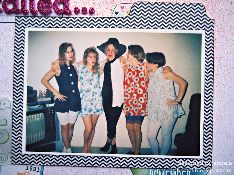
A bit of background: I've been taking the above online class from Shimelle Laine that's winding down now, and it's really helped me rethink where I put pages in my albums and where my blank spots are -- one of my biggest blank spots is my earlier (not-as-cute-as-a-baby-but-instead-rather-awkward-tween-and-teen-) years, so I've been finding favorite older photos to scrap lately. This one called to me from the old shoebox 'o photos:
Oh man, didn't I warn you? Here, you see me with four of my 9th-grade pals (I'm in the orange - shocking, I know), and we're all modeling stylish ensembles from my very own closet in my very own living room during one of my very own sleepovers. Note, please, the lace-trimmed bike shorts and leggings with those babydoll dresses, the floppy hat on my friend Becky, the bangs. Oh, the bangs. (you could also note the original Nintendo unit, which Andrew and I still have AND which still works, believe it or not!) How could I resist scrapping this photo?
A photo like this called out for something funky and fun, so I turned to my Amy Tangerine Sketchbook collection, which I Lurve. Loaf. Love, and used it:
Quite minimal for me, really. I dig it, though. The Mister Huey splatters and inked edges grunge it up a bit. I could get hooked on using little skinny paper bits as a page border.
...and it wants those outfits back! I used the Bits from the line here and as embellishments around the photo. Thickers are also from the same line -- relatively un-messy glitter is a good thing. The cardstock is very nice white woodgrain stuff from Studio Calico.
The photo mat is a pocket that holds my typewritten journaling (on a grid index card -- yay for cool, cheap office supplies), and the thread I used here and elsewhere is actually neon pink, but neon just doesn't photograph well, does it? With a few exceptions, everything came from Scrappy Chic (as usual), but it's also at 2peas and stuff too if you aren't local.
And now for a shout-out for my scrappy friend Sue, who inspired this post by quite rightly noting that the card in my last post was rather Tangerine-esque in its watercoloriness. Thanks, Sue, and congrats on being named to the Get it Scrapped! Creative Team -- that's so awesome! You can read about it at her blog (linked above) and here.
I'll be back with another layout using this line -- one that's an absolute riot of color and pattern. Yay!
Enjoy your day!
01 June 2012
Wait....what? (and FWF)
Since this is a FWF post, most of you are probably just dropping by to see the Unity project...but for the rest of you: I'm back! After an almost-3-month blogging hiatus, I finally found the bug again. My creating bug didn't go anywhere (you should SEE all the layouts I've been cranking out), but the whole photo-editing-writing-uploading-commenting thing was wearing on me for some reason. I missed having an audience of crafty blog friends, though. Happy to be back. :)
Ok, enough of that. How about a card?
I made this one a month ago for our godson's 7th birthday (Can't believe he's SEVEN! That's insane). I actually started by stamping a whole 9x12" sheet of watercolor paper with the bike background from April's Kit of the Month in Staz-On. Then I broke out my old-skool Crayola watercolors (you know, the little oval pans in the plastic case?) and randomly added citrus-hued blotches over the bikes. It made me happy to get all painty! I trimmed out a panel for my card front and drew the frame around it.
I almost never do sticker sentiments on cards for some reason, but I needed something that would really stand out, so I turned to my trusty October Afternoon alphas. The little banner-y things underneath that are the ribbon part of the blue ribbon punch from Jenni Bowlin, made from a handful of scraps that were on my desk. Stickers and punch are both from Scrappy Chic. A couple black accents and I called it good.
Hope you all enjoy your weekend, and I really do think I'll be back soon with more.
Ok, enough of that. How about a card?
I made this one a month ago for our godson's 7th birthday (Can't believe he's SEVEN! That's insane). I actually started by stamping a whole 9x12" sheet of watercolor paper with the bike background from April's Kit of the Month in Staz-On. Then I broke out my old-skool Crayola watercolors (you know, the little oval pans in the plastic case?) and randomly added citrus-hued blotches over the bikes. It made me happy to get all painty! I trimmed out a panel for my card front and drew the frame around it.
I almost never do sticker sentiments on cards for some reason, but I needed something that would really stand out, so I turned to my trusty October Afternoon alphas. The little banner-y things underneath that are the ribbon part of the blue ribbon punch from Jenni Bowlin, made from a handful of scraps that were on my desk. Stickers and punch are both from Scrappy Chic. A couple black accents and I called it good.
Hope you all enjoy your weekend, and I really do think I'll be back soon with more.
08 March 2012
Yep, another sketch!
Hey there, y'all!
There's a new sketch challenge blog out there called Retro Sketches, brought to you by some of the same talented ladies from the ColourQ challenge blog. They're cardmakers, but I was inspired to use their first sketch in a slightly different way....
...It's probably no surprise that this magically turned into a layout :). I've really been on a scrapping kick lately! So, here you go:
Aside from the change in scale, the only real way I changed the sketch is by replacing the focal point with a series of three little photos (in this case, photos of Simon snacking on some cinnamon roll crumbs -- sneaky cat!). Technically, there's also one additional layer:
...tulle! It's a little easier to see here, but feel free to enlarge the photo. The tulle adds really subtle texture, and I have to remember to use it more often! This is another layout using my first Studio Calico kit, along with a few bits and bobs from the ol' stash.
You have until the end of the day to play along with this challenge -- it really does make for some cute cards, too, as you can see over on the Retro Sketches blog. Have fun!
There's a new sketch challenge blog out there called Retro Sketches, brought to you by some of the same talented ladies from the ColourQ challenge blog. They're cardmakers, but I was inspired to use their first sketch in a slightly different way....
...It's probably no surprise that this magically turned into a layout :). I've really been on a scrapping kick lately! So, here you go:
Aside from the change in scale, the only real way I changed the sketch is by replacing the focal point with a series of three little photos (in this case, photos of Simon snacking on some cinnamon roll crumbs -- sneaky cat!). Technically, there's also one additional layer:
...tulle! It's a little easier to see here, but feel free to enlarge the photo. The tulle adds really subtle texture, and I have to remember to use it more often! This is another layout using my first Studio Calico kit, along with a few bits and bobs from the ol' stash.
You have until the end of the day to play along with this challenge -- it really does make for some cute cards, too, as you can see over on the Retro Sketches blog. Have fun!
05 March 2012
A Sunday sketch (on Monday)
Happy Monday!
A quick post for today -- in a bit, I'm heading to Ohio to visit a friend for the day. Hooray for Spring Break! But for now, I've got a layout I made just yesterday up at Scrappy Chic. (Please pardon the nighttime photos.) I used the Sunday sketch from Studio Calico (and feel free to check out their post -- the sample layout from Kelly Purkey is so fun!):
This also marks one of the first layouts I've made with my new Studio Calico kit subscription -- last month's kit (Daydream Believer - oddly timely title!) was my first one, and I dig it. Here's my take:
Yeah, that's me (pretending to) smooch a portrait of a very serious-looking dude. I think the title explains most of what you need to know. Andrew snapped this one after the Collage Concert at the University of Michigan, which means we were surrounded by both college kids and older folks in furs and stuff. Silly, indeed.
I had some kit and stash items I wanted to use, so I embellished the sketch a bit. Here, you can see some fabric trim from the kit, which I misted in aqua and then stamped. The epoxy circles are from the kit, but the little badge is ancient American Crafts.
I'm happy to see that sequins are trendy right now, especially since I already own some. I used gold sequins to accent the gold washi tape under my title (I think the gold tones down the minty-ness of the alphas somehow...which is good for me since mint is good on this layout but isn't normally a color I like very much). Both alphas and the minty twine are from Scrappy Chic, and everything I haven't mentioned yet is from the kit (including that awesome woodgrain chevron paper, which is from the latest Dear Lizzy collection...I might need to stockpile a few sheets of that one!).
Anywho, I gotta pack a bag and get a few things in order, so I'll leave it at that. Hope you have a lovely day!
A quick post for today -- in a bit, I'm heading to Ohio to visit a friend for the day. Hooray for Spring Break! But for now, I've got a layout I made just yesterday up at Scrappy Chic. (Please pardon the nighttime photos.) I used the Sunday sketch from Studio Calico (and feel free to check out their post -- the sample layout from Kelly Purkey is so fun!):
This also marks one of the first layouts I've made with my new Studio Calico kit subscription -- last month's kit (Daydream Believer - oddly timely title!) was my first one, and I dig it. Here's my take:
I had some kit and stash items I wanted to use, so I embellished the sketch a bit. Here, you can see some fabric trim from the kit, which I misted in aqua and then stamped. The epoxy circles are from the kit, but the little badge is ancient American Crafts.
I'm happy to see that sequins are trendy right now, especially since I already own some. I used gold sequins to accent the gold washi tape under my title (I think the gold tones down the minty-ness of the alphas somehow...which is good for me since mint is good on this layout but isn't normally a color I like very much). Both alphas and the minty twine are from Scrappy Chic, and everything I haven't mentioned yet is from the kit (including that awesome woodgrain chevron paper, which is from the latest Dear Lizzy collection...I might need to stockpile a few sheets of that one!).
Anywho, I gotta pack a bag and get a few things in order, so I'll leave it at that. Hope you have a lovely day!
03 March 2012
Peek-a-Simon
Hi there -- hope you're having a great Saturday!
This past week, our little Simon cat had some minor surgery -- there's a pin in his leg from when he broke it last summer, and he's grown so dang fast that the pin had to be removed - it was growing right out of the bone! Sorry, that's a little icky to think about. Luckily, the surgery was truly minor and after a couple days in the Cone of Shame, he's back to his crazy orange self.
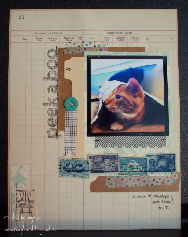
In his honor, here's a layout I made a few weeks ago (while cropping at Scrappy Chic) featuring Simon wearing a big envelope rather than a cone:
This layout is also another stash-buster, but with a twist -- not only are most of the papers fairly old (MME Lush from at least a year ago, Making Memories ledger from for.ev.er ago), but I'm also trying to use more of that stuff I hang onto thinking it'll be fun to scrap with...most of which I keep in a box somewhere, all lonely and unused.
Between the title and photo, you can see an old rolodex card (with an "s" for Simon), and a little paper bag -- I have a whole stack of both, and I'm not even sure where they're from anymore!
I was given a whole stack of little envelopes full of postage stamps that my late grandfather had collected -- they aren't worth money, really, but they do have some sentimental value, so I thought getting them onto layouts and other projects where they can be seen would be nice. I also think some of them are kinda hilariously propagandistic (yes, even blogger thinks that's a word, so I'm going with it) -- I mean, really, Atoms for Peace? Nice. The colors and designs play nicely together, though. There's a row of stitching over them, as well as over the title, and a few bits of it in other places, just for fun. Some tapes and a button finish the look.
I predict that I'll be using more non-traditional, office-y stuff on future layouts. If you've used fun supplies from somewhere other than the scrapbook store, I'd love to hear about it.
Have a lovely day!
PS: I'll be doing a guest post later this month over at the Scrap Our Stash blog (which I found through their former DT member, Sue). I'll be sure to let y'all know when it goes up. For now, you can see my little introduction post here.
{Here's another question though: does it bother anyone else to read an intro written in the third person? Is there some industry standard I don't know about? Anyway, I just wrote mine to sound more or less like me. Let me know what you think. Ok, I'm really done now!}
This past week, our little Simon cat had some minor surgery -- there's a pin in his leg from when he broke it last summer, and he's grown so dang fast that the pin had to be removed - it was growing right out of the bone! Sorry, that's a little icky to think about. Luckily, the surgery was truly minor and after a couple days in the Cone of Shame, he's back to his crazy orange self.
In his honor, here's a layout I made a few weeks ago (while cropping at Scrappy Chic) featuring Simon wearing a big envelope rather than a cone:
This layout is also another stash-buster, but with a twist -- not only are most of the papers fairly old (MME Lush from at least a year ago, Making Memories ledger from for.ev.er ago), but I'm also trying to use more of that stuff I hang onto thinking it'll be fun to scrap with...most of which I keep in a box somewhere, all lonely and unused.
Between the title and photo, you can see an old rolodex card (with an "s" for Simon), and a little paper bag -- I have a whole stack of both, and I'm not even sure where they're from anymore!
I was given a whole stack of little envelopes full of postage stamps that my late grandfather had collected -- they aren't worth money, really, but they do have some sentimental value, so I thought getting them onto layouts and other projects where they can be seen would be nice. I also think some of them are kinda hilariously propagandistic (yes, even blogger thinks that's a word, so I'm going with it) -- I mean, really, Atoms for Peace? Nice. The colors and designs play nicely together, though. There's a row of stitching over them, as well as over the title, and a few bits of it in other places, just for fun. Some tapes and a button finish the look.
I predict that I'll be using more non-traditional, office-y stuff on future layouts. If you've used fun supplies from somewhere other than the scrapbook store, I'd love to hear about it.
Have a lovely day!
PS: I'll be doing a guest post later this month over at the Scrap Our Stash blog (which I found through their former DT member, Sue). I'll be sure to let y'all know when it goes up. For now, you can see my little introduction post here.
{Here's another question though: does it bother anyone else to read an intro written in the third person? Is there some industry standard I don't know about? Anyway, I just wrote mine to sound more or less like me. Let me know what you think. Ok, I'm really done now!}
27 February 2012
Where the rapids are grand.
Happy Monday, y'all!
We had a busy weekend (taxes - fun! cleaning - funner! grading - funnest!). I'm down to one pile of essays, so I'm feeling a bit less stressed on that front. Whew!
That's not what you're here for, though, so how about a mini? A month ago, Andrew and I went upstate to Grand Rapids for a few days -- he had a conference, and I usually go along. The rapids haven't been grand for something like a century (they wanted to use the river for commerce, after all), but the city itself is pretty nifty.
Inside the cover, I adhered a section cut from a bag -- as you'll see, Vertigo Music is one spot we try to hit at least twice whenever we're in town.
{click any photo to enlarge}
Here's a few of the inside pages -- while we were on the trip, I adhered everything but the photos (I'm not that hardcore -- no travel-sized photo printer for me!), but I did put in little notes indicating which photos went where. I took a couple rolls of fun tape, little scissors, my Smash pen (which has a glue stick on one side), scraps of paper and cardstock, some small letter stickers, and a bunch of labels from Martha Stewart's collection at Staples. Everything, including the album, fit into about a quart-size ziploc. Simple! Clockwise from top left: my favorite photo (and the last one we took) at HopCat, some photos and ephemera from the Public Museum, a handful of photos from Vertigo (I had a lot to choose from), a couple random photos along with some ephemera from the conference.Here, you can kinda see how I made the album itself -- basically, I cut some scraps down to vaguely-appropriate sizes and then scored and stitched them right down the middle. They aren't all the same size, which I think is kind of interesting. Additional flaps and smaller pages were stitched in afterwards (didn't want to kill the sewing machine, after all). I even stitched in a little glassine bag from a Thai takeout place once we got home, which you can see in the second photo.
I tied some of this twine around the spine to emphasize the travel-y-ness, and stamped the date here on the back. There's something about the variety of page shapes and patterns that makes this a lot of fun to look through -- and it came together so easily! I just spent a few minutes on it each morning in the hotel room, then printed and added the photos when we got home. I liked preserving the memories while they were still fresh, and this is something I'll definitely do again. Yay!
Ok then, time to get back to the real world. Have a great day!
22 February 2012
Authentique x2
Me again, looking up briefly from my (larger-than-usual) mountain of essays to grade. Luckily, I made these layouts before the landslide :)
These two also feature the latest goodies from Scrappy Chic, namely the Celebrate collection from Authentique. Here, I'm celebrating a new Design Team year -- check it:
Aw, ain't we cute? I wanted to use a PageMaps sketch that's kinda been stuck in my head (it's one from January if you'd like to go hunting), and I also wanted to break out a bit of stash in addition to my new goodies. In this case, I went with some tiny clothespins from Canvas Corp. that had been sitting in a jar since I won them a year ago or more -- oops!
Since I had a good mess going already, I thought I'd whip up a second quick layout:
Different, no? Very manly. Aside from the background, I used mostly scraps to document my husband's favorite watch. An odd subject, maybe, but he really loves this watch, and I really love this picture. (I also love the potty people paper, by the way -- reminds me of a certain stamping pal of mine). Also, if I may get design-y for a minute, I like the way the strong diagonal line in the photo leads the eye to both the journaling in the top corner and the buttons in the bottom. Meant to do that. Yep.
Anyway, that's it for my DT creations this month -- next month we'll pick up speed, since CHA goodies are pouring into the store now. (Don't forget: you can keep tabs on what's coming in on the store blog here.) I grabbed some fun Dear Lizzy papers and stamps the other day, and I can't wait to break 'em out.
After the dang essays. Blergh.
Have a lovely evening!
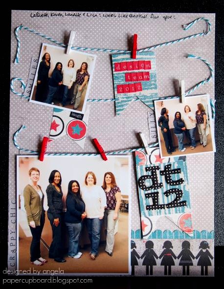
These two also feature the latest goodies from Scrappy Chic, namely the Celebrate collection from Authentique. Here, I'm celebrating a new Design Team year -- check it:
Aw, ain't we cute? I wanted to use a PageMaps sketch that's kinda been stuck in my head (it's one from January if you'd like to go hunting), and I also wanted to break out a bit of stash in addition to my new goodies. In this case, I went with some tiny clothespins from Canvas Corp. that had been sitting in a jar since I won them a year ago or more -- oops!
(other supplies: May Arts twine, AC Thickers, tiny attacher)
I think this picture is hilarious. From what I can tell from my first time meeting these ladies, this is a pretty good representation of their personalities :) Looking forward to checking out their creations all year long.Since I had a good mess going already, I thought I'd whip up a second quick layout:
Different, no? Very manly. Aside from the background, I used mostly scraps to document my husband's favorite watch. An odd subject, maybe, but he really loves this watch, and I really love this picture. (I also love the potty people paper, by the way -- reminds me of a certain stamping pal of mine). Also, if I may get design-y for a minute, I like the way the strong diagonal line in the photo leads the eye to both the journaling in the top corner and the buttons in the bottom. Meant to do that. Yep.
(other supplies: AC Thickers)
I even used my twine scraps to thread those buttons. Not easy -- that May Arts twine is thick! Pretty, though.Anyway, that's it for my DT creations this month -- next month we'll pick up speed, since CHA goodies are pouring into the store now. (Don't forget: you can keep tabs on what's coming in on the store blog here.) I grabbed some fun Dear Lizzy papers and stamps the other day, and I can't wait to break 'em out.
After the dang essays. Blergh.
Have a lovely evening!
19 February 2012
Challenges all around
Howdy there -- hope you're having a lovely Sunday, wherever you may be.
February marks the start of a new year for the design team over at Scrappy Chic (you can see us all here...or in an upcoming blog post right here, if you're patient). One of the lines in my kit this month was Tiny Woods from KaiserCraft (yes, that's really the name. yes, I think it's funny. sometimes I have a seventh-grade sense of humor.)
This line has really lovely colors, but they're challenging -- fall-ish (makes more sense in their home country of Australia than here, I suppose), and it's borderline theme-y, design-wise. So, I challenged myself to make at least two layouts using it, and I turned to a couple of online challenges to get it all done. Whoa. Challenging, indeed.
Here's the first take:
Analog memories, indeed. Andrew has a lot of fond memories of this old tape recorder -- high technology back in the day! I thought the vaguely 70s colors of the paper were perfect for this particular topic.
I used Studio Calico's Sunday sketch from last week to help me out:
By making the shift from 12x12 to 8.5x11, I had to squish some elements, bumping the journalling below the title instead of next to it. Otherwise, I was (surprisingly) faithful to the original.
The tag with my title on it is misted very lightly with Mister Huey's Clover, and I typed up my journalling on the B-side leftovers of my main paper. The buttons are chipboard from Bazzil, and I misted the heck out of those with the same Clover color. Did you know that Scrappy Chic will be carrying Mister Huey's any day now? That makes me very happy.
While I was at it, I tackled the challenge from The Creative Type to scrap your celebrity crush. How fun is that? The samples on their blog are great, too. I had no trouble at all choosing my crush -- the hardest part was choosing a photo from the interwebs. Here's what I came up with:
Oh, Paul Rudd, how is it that such a funny dude can smolder at the camera that way? Sigh. Anyway, you can see I used the same paper as above, plus a subtle woodgrain pattern. I'm less than pleased with my splatters -- the blue were supposed to be flocked, but the flock didn't stick well enough, so I had to do a second coat with Stickles. And then, when I was setting the thing up for photographing (almost 24 hours later, by the way), I smeared the white splatters (dang you, OA Sprinklers!). So, whatever. I still like the end result, warts and all. I'll just skip the close-up, ok?
In the end, my challenge-based layouts made the challenging paper line less of a challenge. Dig? Dig.
Feel free to go watch a Paul Rudd movie now. Enjoy!
February marks the start of a new year for the design team over at Scrappy Chic (you can see us all here...or in an upcoming blog post right here, if you're patient). One of the lines in my kit this month was Tiny Woods from KaiserCraft (yes, that's really the name. yes, I think it's funny. sometimes I have a seventh-grade sense of humor.)
This line has really lovely colors, but they're challenging -- fall-ish (makes more sense in their home country of Australia than here, I suppose), and it's borderline theme-y, design-wise. So, I challenged myself to make at least two layouts using it, and I turned to a couple of online challenges to get it all done. Whoa. Challenging, indeed.
Here's the first take:
Analog memories, indeed. Andrew has a lot of fond memories of this old tape recorder -- high technology back in the day! I thought the vaguely 70s colors of the paper were perfect for this particular topic.
I used Studio Calico's Sunday sketch from last week to help me out:
By making the shift from 12x12 to 8.5x11, I had to squish some elements, bumping the journalling below the title instead of next to it. Otherwise, I was (surprisingly) faithful to the original.
other supplies: ranger tag, pebbles alphas, cosmo cricket tiny type word, twine, bazzill cs, amy tangerine washi tape
While I was at it, I tackled the challenge from The Creative Type to scrap your celebrity crush. How fun is that? The samples on their blog are great, too. I had no trouble at all choosing my crush -- the hardest part was choosing a photo from the interwebs. Here's what I came up with:
other supplies: authentique alphas, studio calico stickers, signo pen, kaisercraft really tiny alphas, doodlebug flock (under the stickles, dang it)
In the end, my challenge-based layouts made the challenging paper line less of a challenge. Dig? Dig.
Feel free to go watch a Paul Rudd movie now. Enjoy!
17 February 2012
12 on twelve: January
Happy Friday! It's sunny and warmish and boy, do I need a nap!
Instead, how about a layout?
How about one that features NOT my usual one or two or three photos, but one with TWELVE, count 'em, 12 photos instead?
Okay, then, here you go:
Ella Publishing is doing this Take Twelve challenge all year, and while I know there's an "official" challenge with a kit and contests and templates and stuff, I decided to just take the idea as inspiration to visually document a whole day every month. This here is January, and my first real experience using Instagram, and I liked it! (I'm a Hipstamatic fanatic, usually.)
The photo-strip look is a bit of a fake-out -- I just printed the photos as a collage, then sliced them up and reconfigured 'em. As you can see, my day was pretty random, so my design reflects that. I also pledged to myself to use mainly older products on these layouts (stash busting is craft resolution #1 this year) -- the floral paper and alphas are both newer Basic Grey (Picadilly - from Scrappy Chic, natch), but everything else is old(er).
I did, however, use a new technique with my old glitter -- it basically involves splattering watered-down glue all over the page and then glittering it up. I learned it through this video tutorial from Rahel Menig (whose style I admire quite a bit [and she has the cutest voice!]). Surprisingly, I didn't walk around coated in glitter afterwards, and so I decided that this is one technique I'd try again.
I have photos from 12 February ready to go, too -- this time, I think I'll try something really clean and geometric, just to see if I can :)
In the meantime, have a great weekend! (I get to go see Anthony Bourdain and Eric Ripert tonight -- what's not to love about that? Yay.)
Instead, how about a layout?
How about one that features NOT my usual one or two or three photos, but one with TWELVE, count 'em, 12 photos instead?
Okay, then, here you go:
Ella Publishing is doing this Take Twelve challenge all year, and while I know there's an "official" challenge with a kit and contests and templates and stuff, I decided to just take the idea as inspiration to visually document a whole day every month. This here is January, and my first real experience using Instagram, and I liked it! (I'm a Hipstamatic fanatic, usually.)
The photo-strip look is a bit of a fake-out -- I just printed the photos as a collage, then sliced them up and reconfigured 'em. As you can see, my day was pretty random, so my design reflects that. I also pledged to myself to use mainly older products on these layouts (stash busting is craft resolution #1 this year) -- the floral paper and alphas are both newer Basic Grey (Picadilly - from Scrappy Chic, natch), but everything else is old(er).
I did, however, use a new technique with my old glitter -- it basically involves splattering watered-down glue all over the page and then glittering it up. I learned it through this video tutorial from Rahel Menig (whose style I admire quite a bit [and she has the cutest voice!]). Surprisingly, I didn't walk around coated in glitter afterwards, and so I decided that this is one technique I'd try again.
I have photos from 12 February ready to go, too -- this time, I think I'll try something really clean and geometric, just to see if I can :)
In the meantime, have a great weekend! (I get to go see Anthony Bourdain and Eric Ripert tonight -- what's not to love about that? Yay.)
14 February 2012
Happy Valentimes!
No, that's not a misspelling. Well, it is, but an intentional one. More on that in a sec.
In the meantime, I thought that after what, three or four weeks of bloglessness, it was high time to get back on track. And since it is indeed Valentine's Day, how about a look at the card I whipped up for my sweet husband?
Aside from paper, there are very few things I love more than beer. Turns out, my hubby is one of them!
I figured it was high time I broke out my cute Lawn Fawn stamps -- love that polaroid frame (thanks, Em!), and the outline alpha set makes me happy. Paired with a bit of stickles, some Echo Park papers and a pint of beer, I think this is one cheery Valentine. (Gold star to the first person who can tell me where my "pint glass" is from!)
In other news, a new Design Team year has just begun over at Scrappy Chic, and I have a brand-new team of ladies to work with. Exciting! Keep your eyes peeled for projects made from great new CHA products soon.
Now, back to the "Valentimes" -- if you're a 30 Rock fan, you already know what I'm talking about, and if you're not...I'm not sure we can be friends. Kidding! But it's really, really funny.
If that image doesn't jog your memory (What, not everyone knows Vlem the prostitute?), feel free to watch an oddly-spliced 30 Rock clip here. Rachel Dratch's cameos are always memorable.
All right then, I hope you all have lovely plans with your sweeties today. If not, I hope you have plans with some paper!
Have a lovely Valentine's Day!
In the meantime, I thought that after what, three or four weeks of bloglessness, it was high time to get back on track. And since it is indeed Valentine's Day, how about a look at the card I whipped up for my sweet husband?
Aside from paper, there are very few things I love more than beer. Turns out, my hubby is one of them!
I figured it was high time I broke out my cute Lawn Fawn stamps -- love that polaroid frame (thanks, Em!), and the outline alpha set makes me happy. Paired with a bit of stickles, some Echo Park papers and a pint of beer, I think this is one cheery Valentine. (Gold star to the first person who can tell me where my "pint glass" is from!)
In other news, a new Design Team year has just begun over at Scrappy Chic, and I have a brand-new team of ladies to work with. Exciting! Keep your eyes peeled for projects made from great new CHA products soon.
Now, back to the "Valentimes" -- if you're a 30 Rock fan, you already know what I'm talking about, and if you're not...I'm not sure we can be friends. Kidding! But it's really, really funny.
If that image doesn't jog your memory (What, not everyone knows Vlem the prostitute?), feel free to watch an oddly-spliced 30 Rock clip here. Rachel Dratch's cameos are always memorable.
All right then, I hope you all have lovely plans with your sweeties today. If not, I hope you have plans with some paper!
Have a lovely Valentine's Day!
20 January 2012
FWF and a layout.
Good (cold) morning!
If it's Friday, it must be time for some Flair. Be sure to check out the Unity blog to see what the big deal is today. In the meantime, how about a little stamp action on a layout?
Aww, ain't we at least a little cute? This photo was taken right after the one in this layout, so of course we look happy ;). I love simple designs like this one -- easy to use over and over again, changing the feel by changing the supplies used.
Speaking of supplies, check out the Unity goodness there near the bottom!
Before I adhered the block of heart-print paper, I sketched a quick line at the bottom, moved it out of the way, and then used the line as a guide to stamp the dashed scallop repeatedly, masking the side edges and offsetting the rows (did it freehand, even. imperfections are fine with me!). The sentiment makes perfect sense, seeing as this photo is from midnight on New Year's Eve.
A glittery button-twine star, stitching around the border and around the photo, and some various tapes and stickers and such, and all is well.
Hope you enjoy the rest of the Unity goodness out there. Have a lovely day!
other supplies: Crate Paper (Paper Heart, Random) papers and border sticker, AC Thickers and tape, Hambly and Tim Holtz tapes, Best Creations glitter paper, October Afternoon button, Twinery twine, Tim Holtz tiny attacher, Stampin' Up punch and ink, and Colorbox ink.
If it's Friday, it must be time for some Flair. Be sure to check out the Unity blog to see what the big deal is today. In the meantime, how about a little stamp action on a layout?
Aww, ain't we at least a little cute? This photo was taken right after the one in this layout, so of course we look happy ;). I love simple designs like this one -- easy to use over and over again, changing the feel by changing the supplies used.
Speaking of supplies, check out the Unity goodness there near the bottom!
A glittery button-twine star, stitching around the border and around the photo, and some various tapes and stickers and such, and all is well.
Hope you enjoy the rest of the Unity goodness out there. Have a lovely day!
other supplies: Crate Paper (Paper Heart, Random) papers and border sticker, AC Thickers and tape, Hambly and Tim Holtz tapes, Best Creations glitter paper, October Afternoon button, Twinery twine, Tim Holtz tiny attacher, Stampin' Up punch and ink, and Colorbox ink.
16 January 2012
ooh, sparkly :)
Hey there!
I'm still working on the dang December album photos (all 80 of them...each of which is inexplicably rotated 90 degrees...blergh. Any insight on doing batch editing in Picnik?).
So, in the meantime, how about something new?
{Warning: slightly mushy photo ahead!}
Oh geez, are those people smooching? And is one of them me? Why yes, that's what you see here. It was midnight on New Year's Eve, one of very few times I condone brief PDA. So I scrapped it, using my latest goodies from Scrappy Chic, namely the Yours Truly line from Echo Park. I had to grunge it up a bit with ink to make it work with the background, which I made all by my lonesome, using some vintage pattern tissue (scrunchily adhered to cardstock with spray adhesive) that I stamped a bit (using these new Hero Arts stamps) and then topped with a coating of glitter spray. (If you use this stuff, put your project in a box and go outside -- it isn't too messy, but there's definitely overspray...you know, made of glitter, so it's gonna get everywhere otherwise).
You can see the glitteriness a bit better here -- even more if you click to enlarge. I adhered some twine behind the photo mat in messy loops just for kicks.
This might be the first time I've used something other than alpha stickers for a title, but this cut-apart element from the EP line said just the perfect thing :). You can see another Hero Arts stamped heart peeking out the side there, too.
So, I've been using scrapping as an escape from an otherwise so-far busy semester, which means you'll be seeing some more pages soon. And the dang album. One of these days.
Until then, have a lovely, hopefully-not-too-cold day!
I'm still working on the dang December album photos (all 80 of them...each of which is inexplicably rotated 90 degrees...blergh. Any insight on doing batch editing in Picnik?).
So, in the meantime, how about something new?
{Warning: slightly mushy photo ahead!}
Oh geez, are those people smooching? And is one of them me? Why yes, that's what you see here. It was midnight on New Year's Eve, one of very few times I condone brief PDA. So I scrapped it, using my latest goodies from Scrappy Chic, namely the Yours Truly line from Echo Park. I had to grunge it up a bit with ink to make it work with the background, which I made all by my lonesome, using some vintage pattern tissue (scrunchily adhered to cardstock with spray adhesive) that I stamped a bit (using these new Hero Arts stamps) and then topped with a coating of glitter spray. (If you use this stuff, put your project in a box and go outside -- it isn't too messy, but there's definitely overspray...you know, made of glitter, so it's gonna get everywhere otherwise).
You can see the glitteriness a bit better here -- even more if you click to enlarge. I adhered some twine behind the photo mat in messy loops just for kicks.
This might be the first time I've used something other than alpha stickers for a title, but this cut-apart element from the EP line said just the perfect thing :). You can see another Hero Arts stamped heart peeking out the side there, too.
So, I've been using scrapping as an escape from an otherwise so-far busy semester, which means you'll be seeing some more pages soon. And the dang album. One of these days.
Until then, have a lovely, hopefully-not-too-cold day!
Subscribe to:
Posts (Atom)